Table of contents
Introduction
As young adults become more adults, taste and social costumes evolve. Suddenly, it’s not about how much booze to get for a massive party, but finding a special liquor for tonight’s dinner that will impress our partner’s family. I have seen people wandering around the liquor aisle, trying to decide which bottle of wine to take home. Some look clueless, others overwhelmed, but definitely most of them don’t seem to be making a rational decision.
I want to solve this! I am creating a product that will help users choose the best wine available based on their personal preferences. I also designed this concept project to practice my UX skills.
Empathize
Interviews
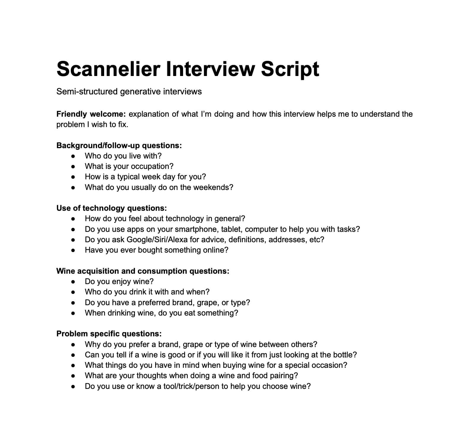
I designed, conducted and analysed a semi-structured qualitative interview to explore the concept and understand why the target group buys and drinks wine.
Show me the Target and Script!Target Group
I targeted people between 30 and 40 years old who drink wine occasionally. I recruited five participants whose interviews were conducted individually and via telepresence (due to the COVID-19 social distancing requirement).
Script
Friendly welcome: explanation of what I’m doing and how this interview helps me to understand the problem I wish to fix.
Background/follow-up questions:
- Who do you live with?
- What is your occupation?
- How is a typical week day for you?
- What do you usually do on the weekends?
Use of technology questions:
- How do you feel about technology in general?
- Do you use apps on your smartphone, tablet, computer to help you with tasks?
- Do you ask Google/Siri/Alexa for advice, definitions, addresses, etc?
- Have you ever bought something online?
Wine acquisition and consumption questions:
- Do you enjoy wine?
- Who do you drink it with and when?
- Do you have a prefered brand, grape, or type?
- When drinking wine, do you eat something?
Problem specific questions:
- Why do you prefer a brand, grape or type of wine between others?
- Can you tell if a wine is good or if you will like it from just looking at the bottle?
- What things do you have in mind when buying wine for a special occasion?
- What are your thoughts when doing a wine and food pairing?
- Do you use or know a tool/trick/person to help you choose wine?
I found this tool essential to reach a higher level of empathy with users. I had to be genuinely curious and detached from any assumption and designer role. Although there’s a high risk of confirmation bias, Thematic Analysis helped to deliver most of the expected insights from the research plan:
- Most participants feel a strong social influence when drinking wine. This affects many of the stages involved, from choosing, to buying, and the entire context of consuming it. Wine, like many other alcoholic beverages, is considered a treat for oneself or for special occasions.
- Although pairing (drinking wine while having a meal) is a frequent practice in most participants, they recognize that they don’t know how to do it as well as they would like.
- The lack of knowledge on how to choose wine can be frustrating and confusing. Most participants end up making random, superficial or “safe” choices just to get it done.
- Almost every participant thinks they have a busy lifestyle. Their time investment is restricted to family, work and social matters.
Survey
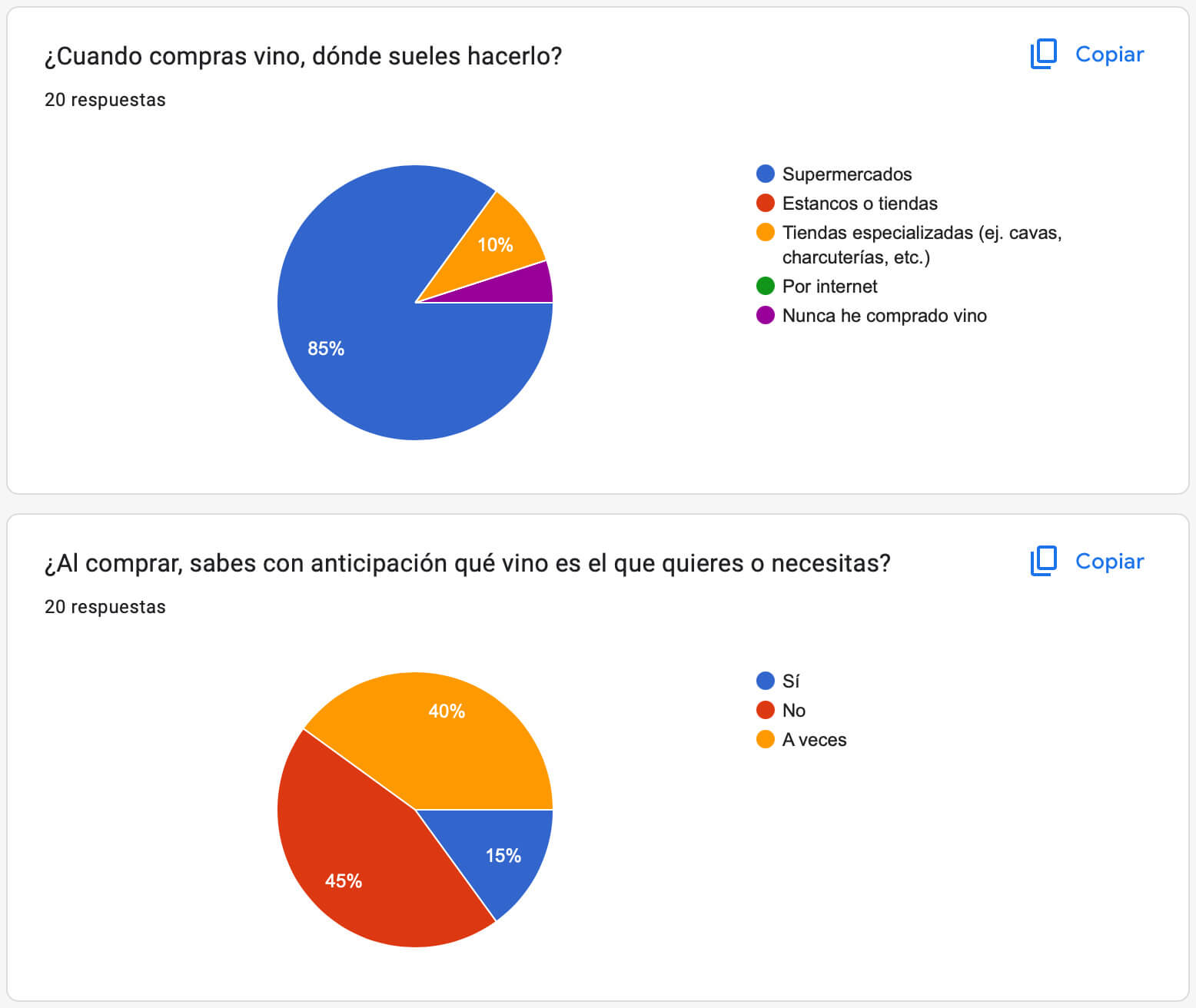
I conducted this survey with twenty participants, who answered multiple-choice and open-ended questions. This type of quantitative research helped me validate results (triangulation) by collecting objective and subjective data from participants, which are equally valuable.
Questions
- Genre
- Age
- Marital status
- How often do you enjoy a glass of wine?
- When you drink wine, you do it because...
- Do you usually combine types/grapes of wine while drinking?
- Do you have wine glasses at home?
- Are you willing to try different types and grapes of wine?
- Do you buy most of the wine you drink?
- Where do you buy wine most commonly?
- Do you know which wine you need or want beforehand?
- How many bottles do you get in the same purchase?
- What is the most important thing you consider when buying wine?
- Did you know that not all types of wine are served at the same temperature, and is decisive to maximize its flavour?
- How much do you know about wine strains? (1 to 5)
- Do you know how to prepare a food pairing with the wine you decided to drink?
- If you answered "Yes" to the previous question: What do you usually choose first when defining your pairing?
- Would you like to learn or have a guide on how to pair wines and meals?
- When you drink without eating food (probably in a social gathering, party, etc.), you choose the type of wine, mainly taking into account...
- You know or think a wine is good because...
I confirmed some insights and dropped assumptions about how this group chooses and consumes wine:
- Wine consumption happens casually, but a common scenario is as a complement for meals. Again, most consumers do not know how to make a good wine-food pairing.
- Almost every consumer buys their own wine, at a grocery store, and more than one bottle per occasion. Though, they usually don’t know which wine they want or need.
- Most volunteers believe that they would enjoy more and increase wine consumption if they had a guide or knowledge on how to buy and consume the product better.
Affinity diagrams
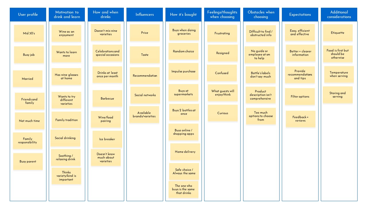
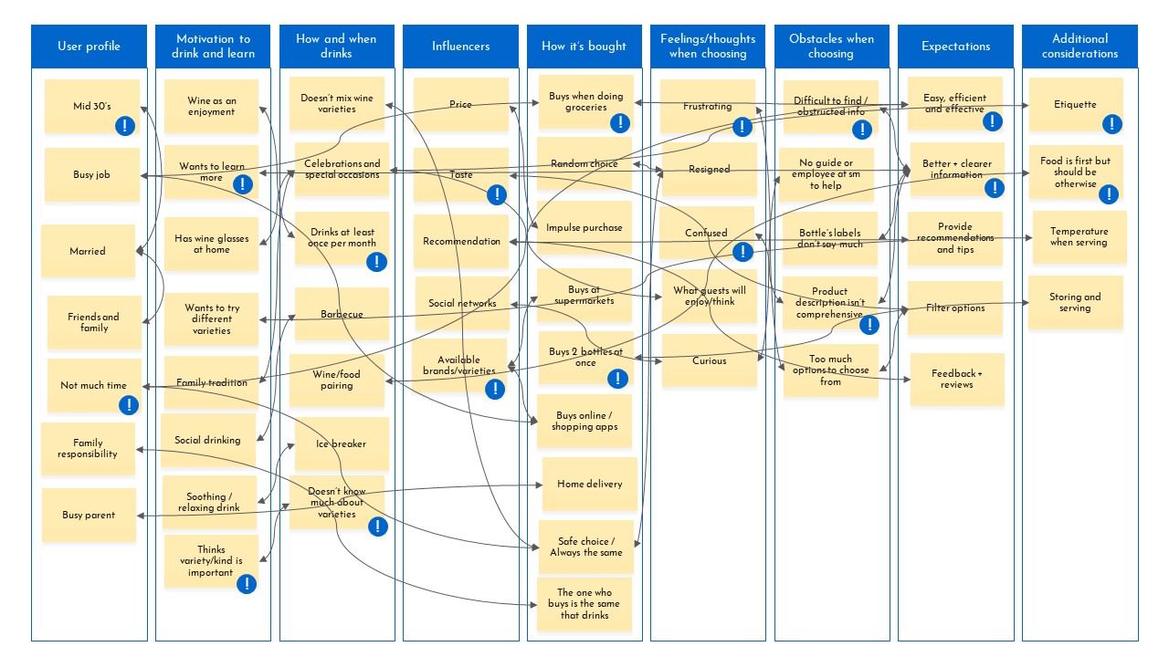
I used this tool as a bridge between the empathize and define stages, as with it I synthesized the previously analyzed data. I grouped related concepts together, identified key themes and distilled interesting behaviours for personas and initial user journey maps.
I tagged key concepts (!) that I found of great value and needed to be represented in the definition of the user. From simple demographics (mid 30’s married men and women) to interesting contradictions (willing to learn more about wine, but not having the time) are important lessons that helped me to build a credible and real image that represents these users.
Personas
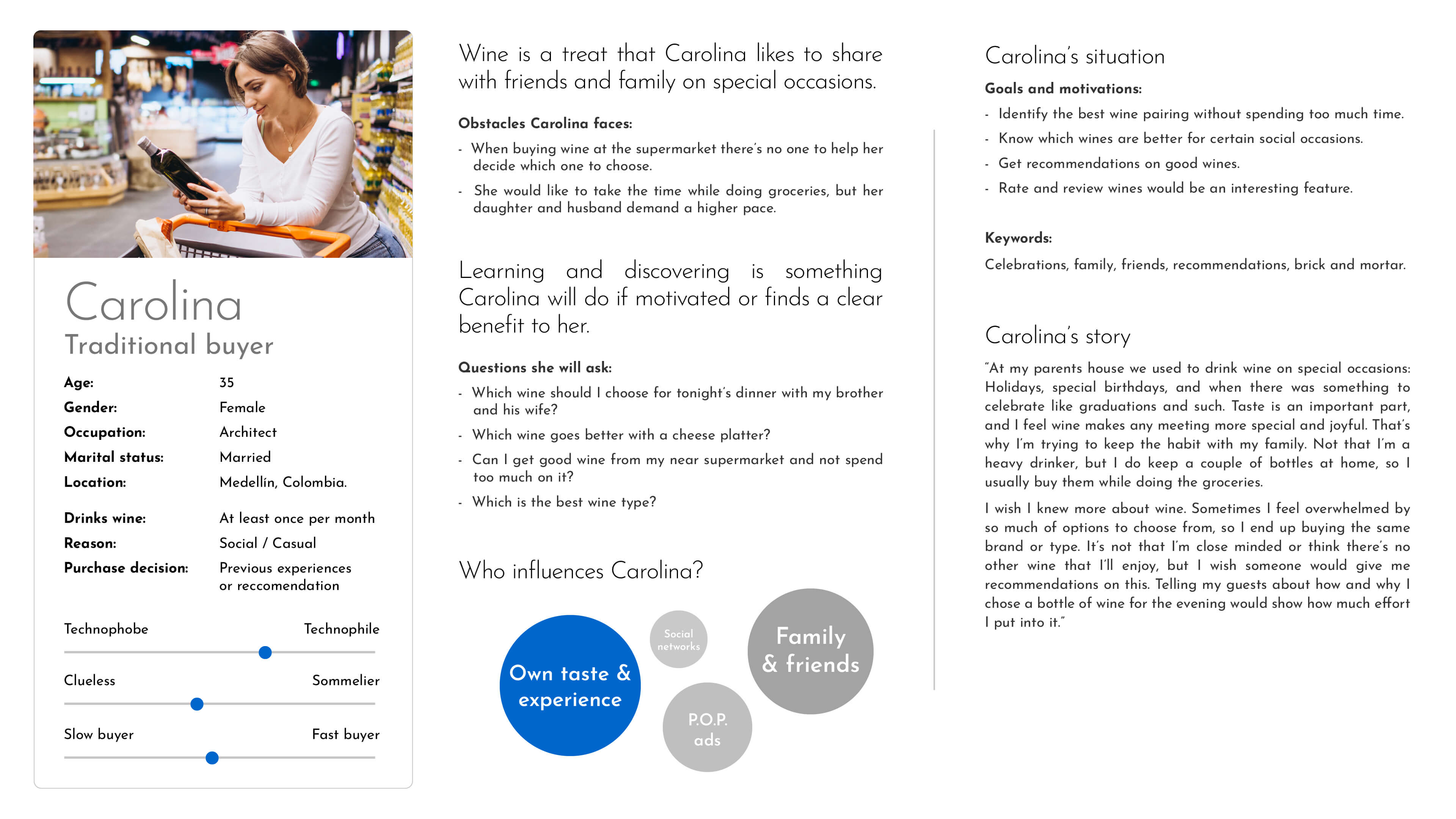
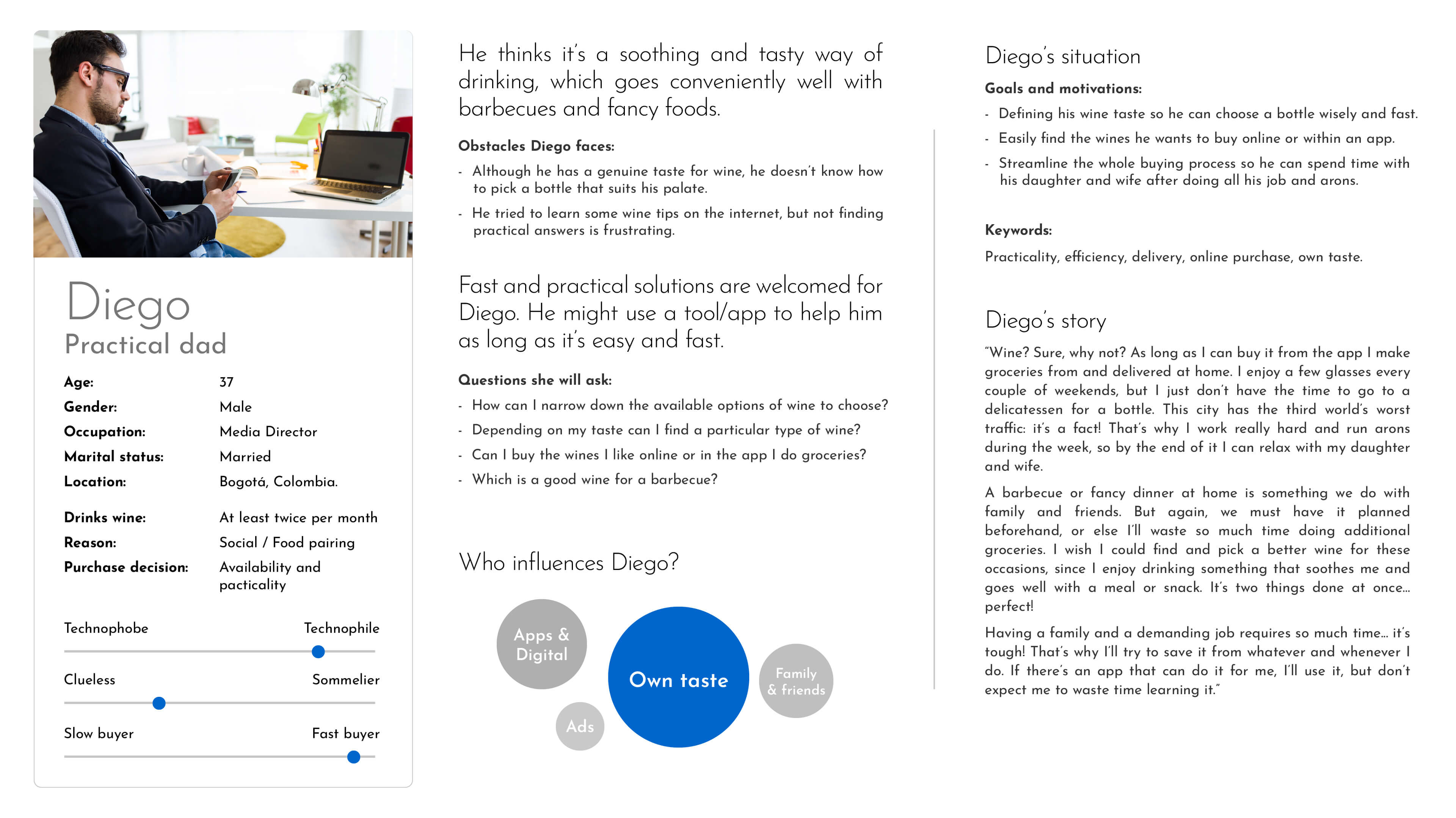
I decided to have primary and secondary personas (one for each). The primary (Carolina) represents most users’ goals, while the secondary (Diego), although shares many of them, has slightly different motivations and methods of achieving those same goals.
Carolina has some conservative traits, yet she’s a strong and decided woman that appreciates the joys of life and the people around her. Diego is quite expressive and casual, which combined with a strong sense of practicality, makes him appreciate the available tools that technology provides. These personas brought me closer to walk in my user’s shoes.
Empathy maps
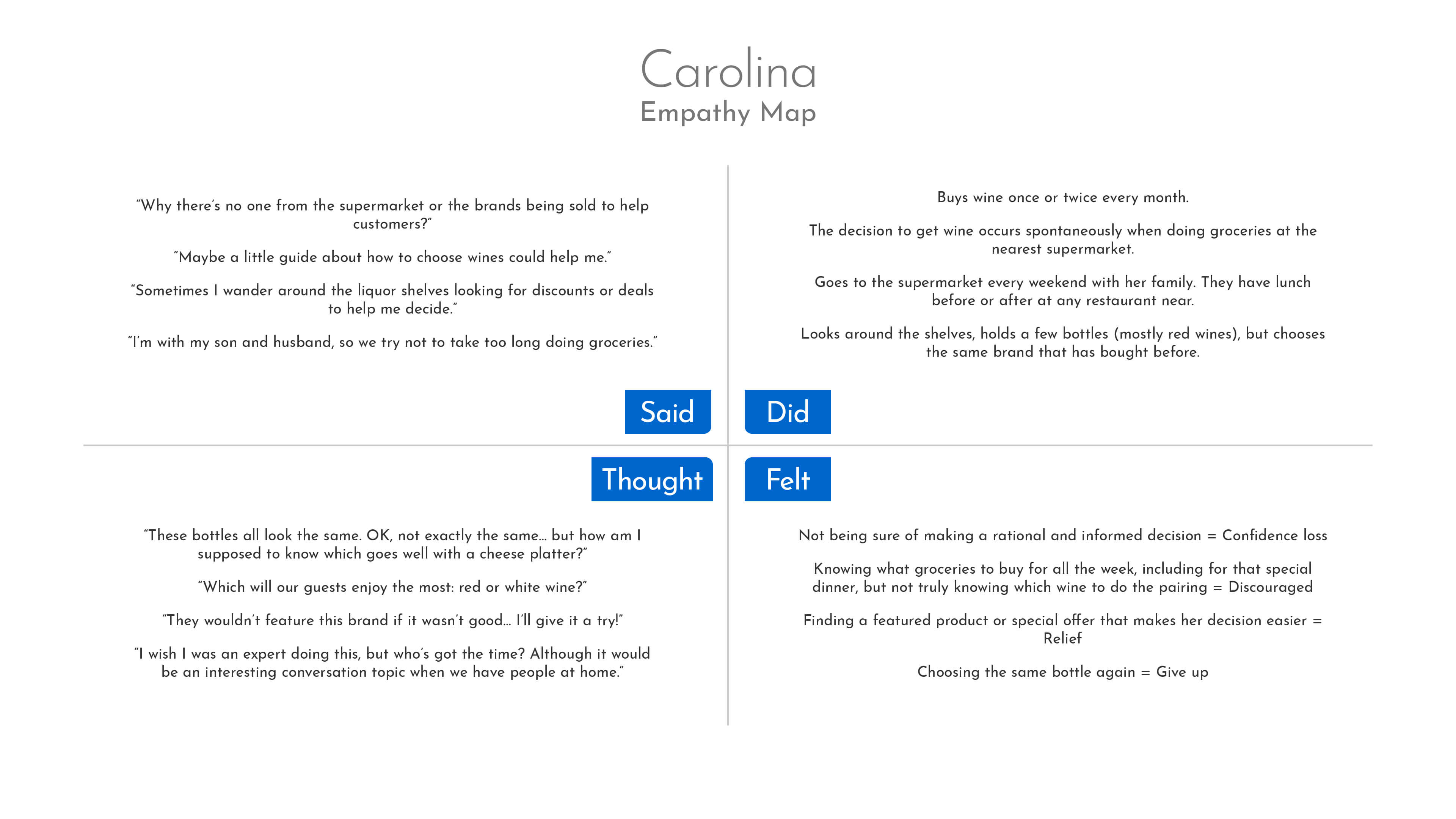
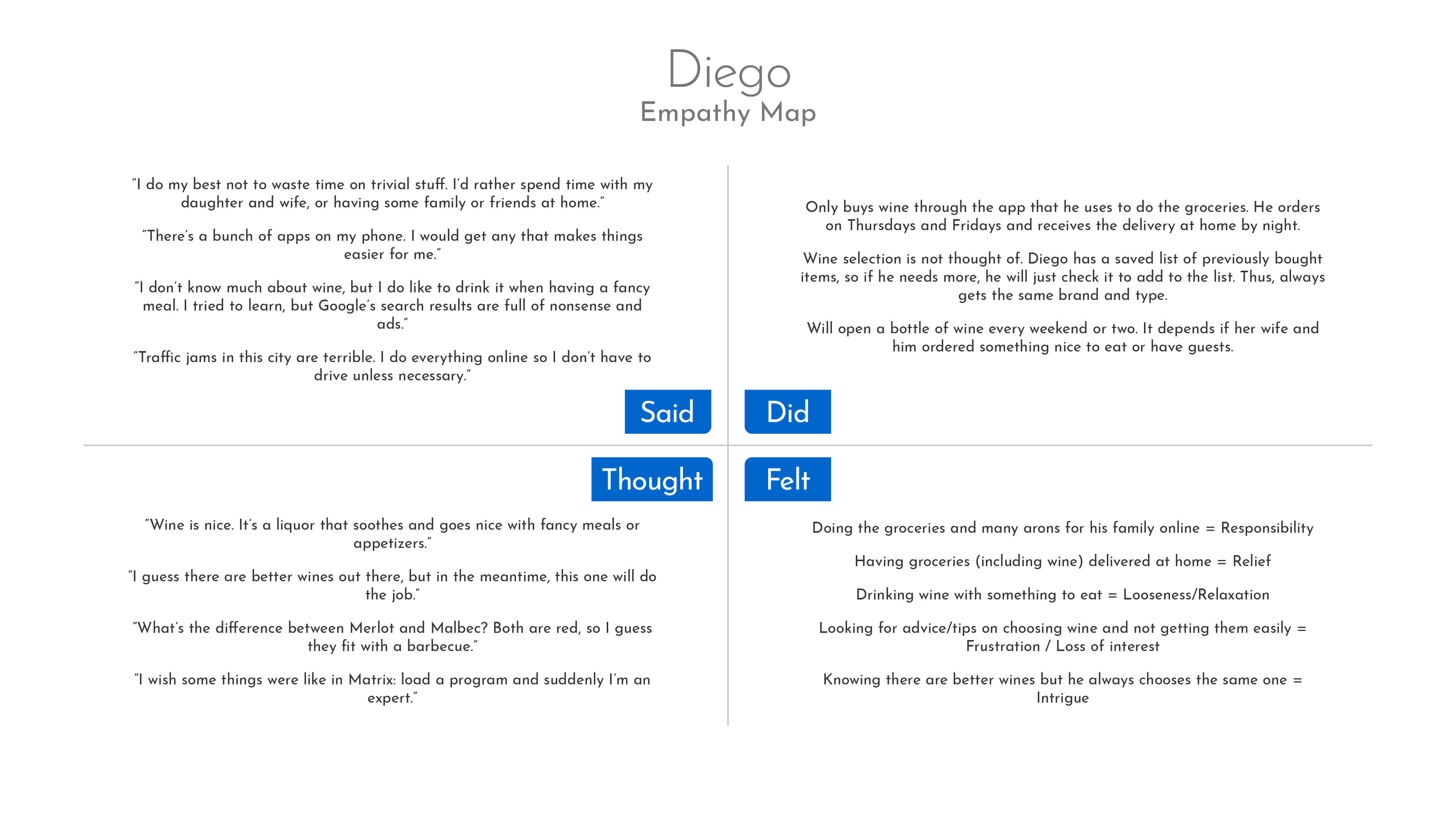
This is a clean statement of what the participants said, did, thought and felt (during the interviews), which I brought into the personas as the user’s voice. My final product must keep present these concepts, as they represent the personas in a nutshell.
Carolina represents most of the participants on how they acquire (at supermarkets) and consume (with family and friends, while having meals and special occasions). The strong social influence and disposition to learn are clear motivators shared with Diego. However, both have short patience regarding tasks that consume their precious time. I reached a better understanding of the what, how and why participants choose and drink the wine they do.
Define
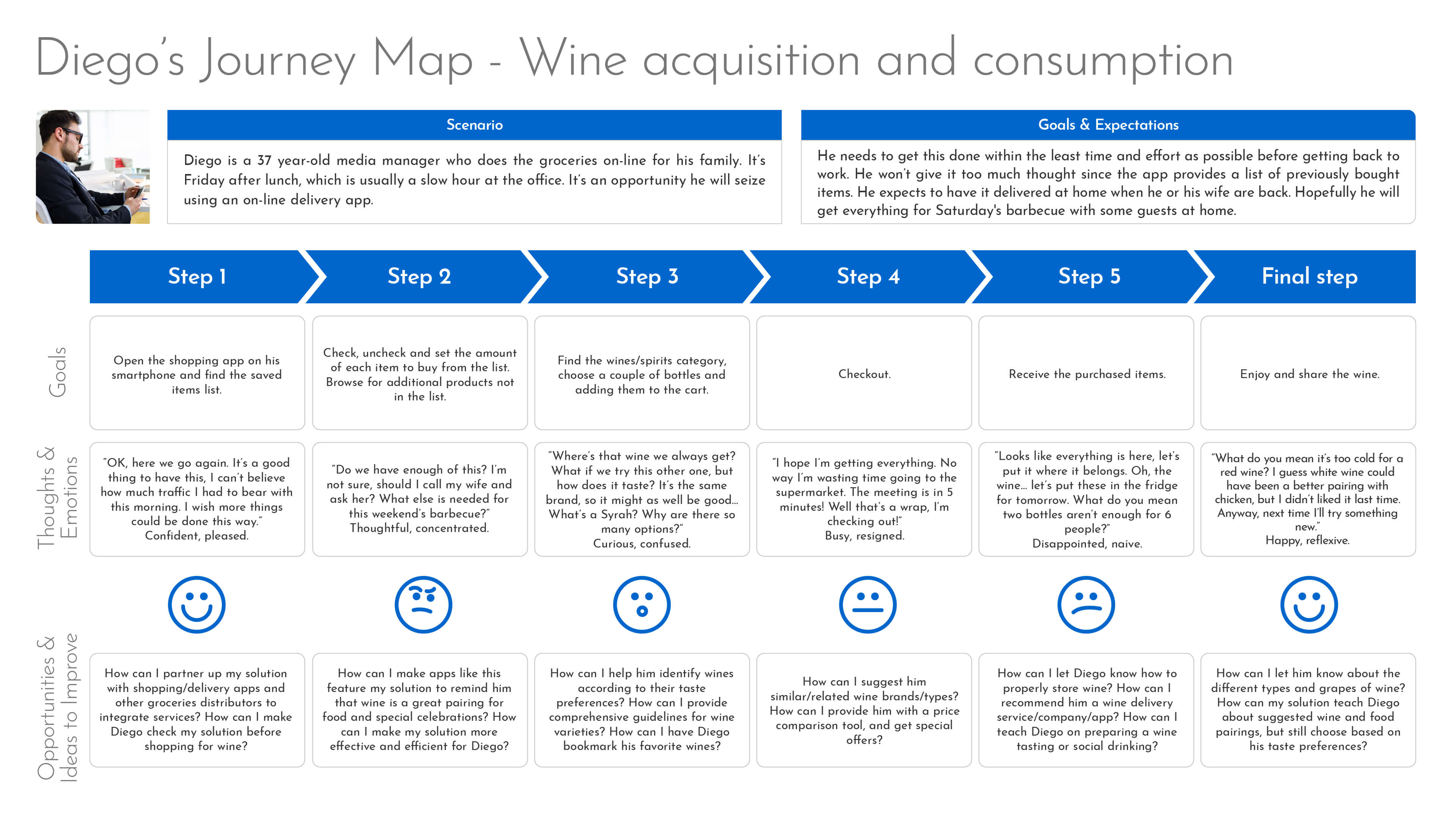
User (Customer) Journey Maps
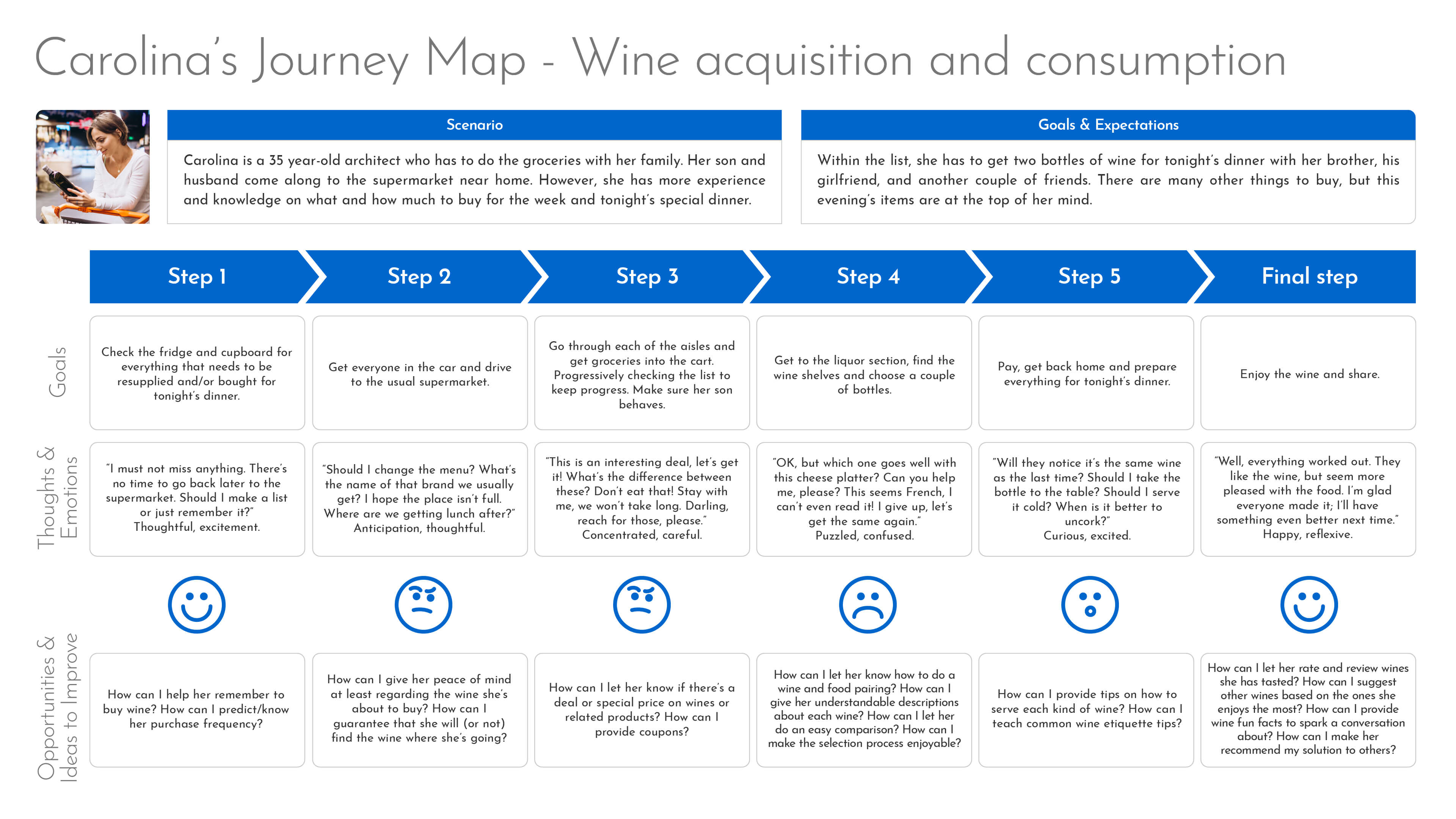
I used this tool to examine the main touchpoints and channels that users are currently interacting with when buying wine. These journey maps were also intended to help me visualize and understand the context of interaction in which my product is expected to perform.
I was able to identify the patterns of behaviour and emotions developed through time together with the pain points. Both users (primary and secondary personas) share an emotional curve, beginning and ending happy. But issues appear in the middle of the process, where the lack of confidence, shortage of time/patience, and confusion arise. This happened, in the most part, when the users faced with the dilemma of choosing the right wine. Here is when I spotted opportunities to define the root problem.
As a personal preference, I tend to write the opportunities and ideas to improve as how might we questions, so I can eventually revisit and improve.
Point of View
This is the cusp of definition! I wanted to define a point of view (or problem statement, or design challenge) to have a goal oriented project to reach my users, satisfy their needs and acknowledge the collected insights.
The POV itself was the best insight. There is nothing else to say, besides that I printed this phrase and pasted it next to my screen. This truly defined the problem I wished to solve.
How Might We Questions
I wanted to tease my way to the Ideation stage through HMW questions. I looked back to the User Journey Maps where I generated preliminary versions of these questions.
HMW
- How might we make the selection process enjoyable?
- How might we instruct/teach users on how to do a wine and food pairing?
- How might we give users understandable descriptions about each wine?
- How might we provide comprehensive guidelines for wine grapes?
- How might we let users do an easy comparison?
- How might we guarantee users that they will find (or not) the wine at their local store?
- How might we teach common wine storage, etiquette and serving tips?
- How might we allow users rate and review wines they have tasted?
- How might we have users bookmark their favourite wines?
- How might we help users identify wines according to their taste preferences?
- How might we suggest other wines based on the ones they enjoy the most?
- How might we partner up our solution with shopping apps and other groceries distributors to integrate services?
- How might we make users check our solution before shopping for wine?
Expanded HMW
- In what ways could we predict/know the user's purchase frequency?
- How might we help users remember when to buy wine?
- What would happen if we suggest users related products to his wine selection (like glassware, appetizers, etc.)?
- In what ways could we provide wine fun facts to spark a conversation about?
- What's stopping us from selling wine directly instead of just helping users choose?
- How might we let users know if there’s a deal or special price on wines or related products?
- What would happen if we provide users with a price comparison tool?
- In what ways might we make users recommend our solution to others?
Ideation
Analyzing the competition through HMW answers
A safe choice to kick-off the Ideation phase is Brainstorming, however, I was on my own in this project. So I decided to critically assess how others have solved the problem and identify opportunities. Vivino is an amazing website and mobile app that helps users “Discover the Right Wine”.
Vivino’s answers to my HMW questions
Q: How might we make the selection process enjoyable?
A: The app encourages users to scan a bottle’s label to obtain all the information about that wine. This includes average price, full and detailed description, food pairings, etc. Since the app also works as a social network, users can score and review every wine they taste. Additionally, there are challenges that users achieve by scanning certain wines and completing tasks; that’s an interesting use of gamification.
Q: How might we instruct/teach users on how to do a wine and food pairing?
A: Users can scan or search for a wine, then they can scroll to the suggested pairings section. Additionally, users can make a reverse search by defining a food type to receive wine recommendations.
Q: How might we give users understandable descriptions about each wine?
A: Vivino offers a thorough description of every wine, from straight facts (regional style, grapes, alcohol level, etc) to highlights about how other users are consuming it. There are descriptions for each grape and style, plus some fun facts. The app even provides full details on the winery (location map, other wines produced, rating), and a vintage comparison.
Q: How might we provide comprehensive guidelines for wine grapes?
A: Each wine type and grape has a screen where users get a complete explanation. The history, acidity level, color, body, food pairing, and countries where used are some of the information given. Since names are in foreighn languages, there are tips on how to pronounce them correctly.
Q: How might we allow users rate and review wines they have tasted?
A: As the information is crowdsourced, users define the taste characteristics, vote on the taste notes, and can go deeper on reviews.
Q:How might we have users bookmark their favourite wines?
A: Every scanned bottle label is stored in “My wines” collection. Users can also add any wine from the typed search results. Once a wine is stored in “My wines”, you can add to it a place (GPS enabled), the price you paid, and a personal note. Also saved wines can be added to a wishlist or to the user’s cellar (another list intended for stored bottles that haven’t been tasted).
Q: How might we suggest other wines based on the ones they enjoy the most? How might we help users identify wines according to their taste preferences?
A: The app has a “Taste profile” that is built from the wines that the user has rated to provide personalized recommendations. Befriended users can see each other's taste profile and share recommendations too.
Q: In what ways could we provide wine fun facts to spark a conversation about?
A: At least three fun facts can be found on every wine screen. They are mostly related to the grape or type.
Q: What's stopping us from selling wine directly instead of just helping users choose?
A: Vivino sells wine and ships to 16 countries around the world. Their collection is huge, which offers options for every taste and budget. They even have special offers and discounts on bundles.
Q: How might we make users check our solution before shopping for wine?
A: The app encourages users to scan wine labels. This may suggest that Vivino is not interested in having users check the app before shopping wine, but at the precise moment of deciding. However, this might come naturally with engaged users: they will check it anyway thanks to the motivational tools and perks like the challenges, cellar list, and friends (social networking).
Q: In what ways could we predict/know the user's purchase frequency? How might we help users remember when to buy wine? How might we let users know if there’s a deal or special price on wines or related products?
A: The app has notifications that allow users to know when special offers and deals are available. This might be triggered by any of the user’s input.
Vivino’s unanswered (or partially answered) HMW questions
Q: How might we let users do an easy comparison? What would happen if we provide users with a price comparison tool?
A: There is no way of comparing wines. The only way to see more than one at the same time is through the website, by opening on separate browser tabs, yet this is still not a proper way to compare.
Q: How might we teach common wine storage, etiquette and serving tips?
A: The app does give serving tips regarding the temperature and preparation. However, storing and etiquette tips are not given. There is an almost hidden “Wine News” section in the website where there are tons of articles with serving tips, etiquette and such. Very interesting, but underestimated.
Q: How might we guarantee users that they will find (or not) the wine at their local store?
A: If Vivino doesn’t sell the wine the user selected, it will show links to online stores that do. However, the suggested links are not related to the user’s location, so shipping is not guaranteed.
Q: How might we partner up our solution with shopping apps and other groceries distributors to integrate services?
A: Vivino has a merchant partner program, which allows wine producers and merchants to sell their wines through their plattform. Additionally, the affiliate program is directed for partners who are interested in advertising the Vivino brand. However, there is no visible connection with shopping apps, supermarkets or such.
Q: What would happen if we suggest users related products to his wine selection (like glassware, appetizers, etc.)?
A: This happens in the “Wine news” articles page.
Q: In what ways might we make users recommend our solution to others?
A: The classic share button is available on the wine screens. Users may their prefered social networks, email clients, etc.
OK, got it!Vivino is a robust product that almost answered all of my HMW questions. This may seem very convenient for some, but I do not agree with the swiss army knife approach. Having solutions to every different problem made me believe that Vivino’s app suffers from featuritis in its effort to bring too many functionalities to users. Besides, my users didn’t have the time to browse and learn all the features this app has. The context of use told me that they need a fast, straightforward solution. However, the app’s wine scanner was a very interesting reference to consider.
SCAMPER
I decided to use the SCAMPER method on Vivino to generate thoughts that sparked innovation from it. This was a good idea since other popular competitor apps offered similar functionalities (but in a less mature and attractive way).
Substitute
My users can’t even relate to an enthusiast level of expertise with wines. They enjoy and drink wine, but not as frequently (twice per month) and enough to build a taste profile based solely on their experience. Rating the boldness, tannicity, dryness, etc. of a wine is something beyond my user’s knowledge and disposition.
Instead of this, users should be able to build their taste profile by asking their preference of flavours commonly found in fruits, vegetables, meats, etc. This is a valid approach used by experts and it’s more relatable to my users. I also confirmed this with a sommelier, who states that the best way to know which wines to recommend to someone depends on knowing its palate and personal taste. This covers one of the key problems in the Point of View: the user’s taste.
Combine
The target group doesn’t have a wine cellar, nor will go hunting for a specific wine sold at specialized stores. They want to know if the wine they have in front of them is good enough. This is a critical point for users, and needs to be as efficient and straightforward as possible.
Carolina would be pleased to use the bottle label scanner that Vivino features. With just one hand and without typing a letter she would find how compatible she is with that bottle in front of her. However, Diego will need a search field to type in the brand and type of the wine in his phone/computer screen.
Combining these two methods will provide alternatives that users will use depending on their context of use, which directly affects the usability of the product I‘m designing.
Adapt
Vivino has strong social functionalities: follow users, connect their Facebook contacts, make posts and comments, and share wine recommendations. These functionalities may be very interesting for at least aficionados who consider wine a hobby, but as previously defined, those are not my users.
However, the recommendations functionality is worth adapting into a lighter and indirect version. Users shouldn’t have to engage into a strong social interaction to see which related/similar wines were enjoyed by other users. In a few words, a “Other users enjoyed these similar wines” module.
Modify
According to the above (SCA) it’s a good idea to magnify the use of the wine scanner and search. It should become clear for users that this is the principal function of the product, which provides nested affordances to make a clear identification of wine and check how recommendable it is for the user.
Considering the context of use, it’s better to minify Vivino’s social networking functionalities. The key concept to distill is “safety in numbers”, to make users feel more confident by showing how many others have tasted/enjoyed the wine they have just scanned/searched. This will reinforce the app’s credibility and give a sense of humanity behind it.
Put to Another Use
Although is not the desired intention of the solution to design, this product can also be used in supermarkets and wine stores. A standalone version could be used in POP interactive displays, encouraging users to scan the bottles they are interested in and see how well they match with their taste. Also, wine brands can use this app to attract new consumers through precise recommendations within their own product catalog.
Eliminate
In general terms, there’s a lot I could simplify from Vivino’s app to make a more relevant product for my users. Buying through the app or where to buy are not useful functionalities that don’t aim to solve the biggest problem and pain point in the customer journey map. My users are not facing a huge assortment of options at their local grocery store or delivery app. It all comes down to “I like these flavours and will drink wine in these conditions, what’s the best you have for me now?”.
Rearrange
Vivino is not designed to present users with a specific task, and the UI demonstrates there are 4 main uses for the app (top lists, search, friends, my profile). And that’s fine for users who want an app that helps them manage their hobby and learn a lot from it. But my users need constraints that allow them to focus on the most important part and functionality of the app: find the right wine. A nested affordance (aka. Wizard pattern) approach provides a much more efficient step-by-step process that suits better the task my users need to perform.
OK, got it!After analyzing Vivino, I collected a bunch of ideas to design a product that caters to my users:
- I can learn user’s taste profile by asking their preference of flavours in other types of food.
- Use a bottle label scanner to identify wines fast, but keep a search field to type in the brand and type of the wine.
- Don’t include social features, but make use of “safety in numbers” concept.
- Use a Wizard pattern to keep user focused on fast and easy steps towards their goal. Keep in mind Hick’s law.
Challenge Assumptions
I have collected a few ideas from the SCAMPER exercise, but they felt a bit ethereal. I decided to make a brief challenge assumptions session to mature and generate more ideas.
Show me the Challenged Assumptions!
Assumptions
- My personas don’t have time to waste while doing grocery shopping. Installing an app, setting it up and getting it to work is too much to ask.
- Users of my app will scan/search a wine or two, but then they will forget or lose interest and go back to safe/random choices.
- The target group is a very small niche, making the app obsolete in a short amount of time.
- My users are avoiding supermarkets and grocery stores due to the health risks of COVID-19. This changes the primary persona’s channel and context.
- Some users will find it too difficult to scan a bottle’s labels. Accessibility or skill barriers won’t let them operate the main functionality thus rendering it unusable.
- The taste profile works for some users, but others will receive inaccurate wine matches and suggestions.
- Inadvertently, I will end up wasting the user's time by making them scan and search through options.
Challenge
- How can I make the setup and scanning processes as efficient as possible? Do users have to create an account in order to use the app? Is it necessary altogether?
- How can I keep users interested in my app? Am I designing a discardable tool that works only a few times?
- Am I narrowing too much the features and functionalities for the sake of efficiency and cognitive load optimization? Can I include more features without affecting the user flow and making it more attractive to a bigger audience? How can I make it attractive to extreme users (wine connoisseurs and complete clueless users)?
- If users can’t have a bottle physically in front of them, how can they perform a label scan? How can I bypass/replace the scan feature to show wine matches and suggestions to users? Do they always have to scan or search for a wine to remember the last one they enjoyed?
- How can I make the scan and search features as accessible as possible? Which disability types are the most affected by accessibility issues when using the camera function of a mobile device?
- How can I guarantee that the taste profile survey will provide accurate and enough data from users?
- How can I let the user know that they have scanned/searched enough options? How and when should I recommend them to settle with the best match so far?
Ideas
- The taste profile survey must be as short as possible (10 - 15 questions max.). The survey should reveal each question individually and transparently showing the user’s progress. Illustrations, plain language and affordable UI interactions must be in place to make it a positive experience. Allow social networks and third-party accounts sign-up can also help by providing user’s data (only the reasonable amount) without them having to type it in. I must keep in mind that once the app has been set up (taste profile complete) it becomes a tool for “I-want-to-know” micro-moment.
- The app’s database must be broad enough to always deliver results to scan/search queries. This will prevent users from deserting and promote exploration. I should reward users with gamification patterns (badges, levels, challenges) and exclusive discounts (partner up with supermarkets, stores and wine brands).
- I should include small cards with interesting content like fun facts and pro tips that encourage deeper learning about the scan/search result. These must not obstruct the main content.
- Users should always be presented with the option to scan or search a wine label. Also, a previously scanned and/or favourite wines list should be available, so users can review their progress and guide future purchases.
- The UI must make it easy to select and operate any of them with one finger. For the search field, predictive search (or autocomplete) must be available. I must keep the UI in line with a very simple conceptual model, and also seek to comply (at a high level) with accessibility standards. I will have to test, since early prototypes, the product with users with disabilities.
- I should seek for an organization or company of wine experts that provides me with consultancy to build the taste profile survey and endorsement. If I show users this professional background, they will trust the app more.
- I should provide a comparison tool, so that users can spot differences between the latest scanned/searched wines. I must define a match score that measures how compatible the scanned wine is with the user. I will also display a “best match so far” alert when the user has found the highest level of match score per session.
This exercise not only gave me the opportunity to mature ideas, it also brought new ones from problems I didn’t realize. It also pointed out areas where I need expert advice in order to provide accessible and credible user experience.
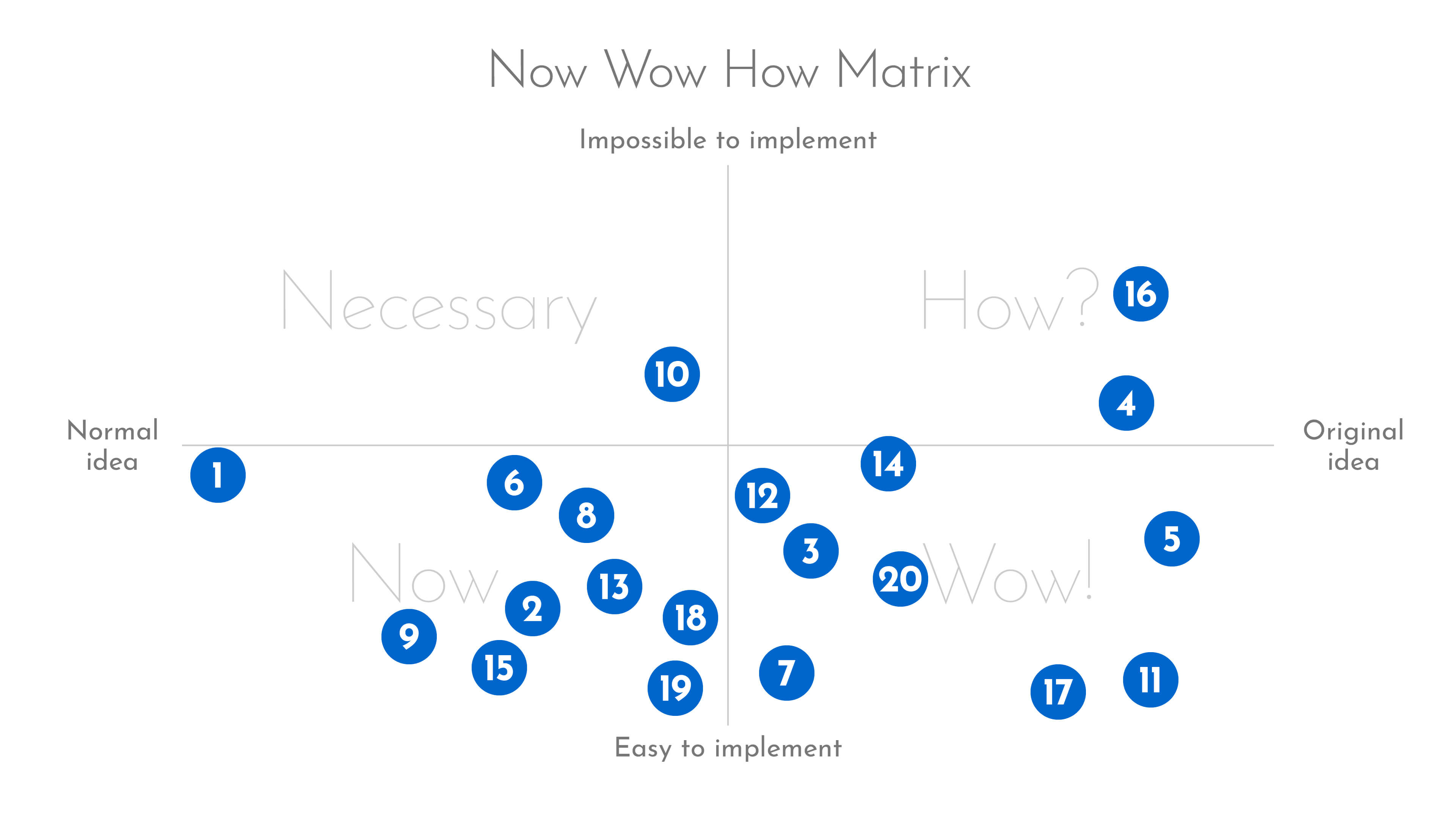
Now, Wow, How Matrix
To this point, I have amassed a significant amount of ideas which needed to be filtered and categorized (convergent stage). If I was working on a team and with UCD methodology I would have used a more thorough tool (like design maps, use cases, user stories, and even then card sorting), for the current purpose this one did the job just fine.
Show me the Matrix (no pun intended)!
Mapped ideas
Now
1. Label scanner (using device’s rear camera) to identify a wine option at the supermarket or grocery store.
2. Predictive search field for regular type-in search functionality as an alternative to label scanning.
6. The label scanner tool has an auto-shutter functionality that automatically submits the image to bring back the wine screen.
8. The task of scanning/searching a wine will unfold like a “wizard” setup. Nested affordances will be gradually displayed to guarantee that users achieve their goal in terms of a micro-moment.
9. Reward users with users after completing certain challenges. These are easy and/or frequent tasks like: achieving a certain number of scans/searches, finding a 50% match score wine, scanning/searching 10 wines of the same type/brand, etc.
13. Recommend to a friend button that sends a message (email, SMS, QR, WhatsApp, Messenger) to another user with the app download link. “Wine App helped me choose the wines I truly enjoy! Install the free app here. Cheers.”
15. Deliver notifications for special offers and ask to favourite a previously scanned/searched wine.
18. A previously scanned and favourite list for users to look back into.
19. Number of users that scanned and enjoyed a wine.
Wow
3. Before scan or search, ask users if there’s a food pairing and range number of guests for better suggestions.
5. Match score displayed after a scan/search has been performed. Tooltip will provide information to explain that the score is based on the user’s taste profile and expert advice/endorsement.
7. Other users enjoyed these similar wines list to display no more than 3 items that have a similar match score and type.
11. Best match so far alert displays when the user has scanned/searched more than one wine, showing the wine and score for that matter.
12. Share button for every scanned/searched wine to create a social media post (Facebook, Twitter, Instagram, etc.). The post includes a link to a static page with the wine’s data and promoting the app’s features.
14. Add to compare tool to allow users identify main differences between the last 2 or 3 scanned/searched wines.
17. If the scanned/searched option has a low match score, suggest a wine type/grape to guide the user to a better score.
20. Plain language and comprehensive descriptions in the wine screen must be provided and prioritized: a) Name/brand, type/grape, year, match score (%), discount coupon (if available). b) Taste characteristics, pairings, users enjoyed this wine (number), nationality, related/similar wines, fun fact, serving tip.
How
4. First time users will have to build their taste profile by completing a survey that asks for their preference about different types of food and aromas.
16. Partner up with a wine brand, supermarket or distributor to provide exclusive and immediate discounts.
Necessary
10. One-thumb-one-eye operability throughout the UI that promotes an efficient interaction in spite of the user’s external environment full of distractions. High accessibility must be met too.
OK, got it!I collected a reasonable balance between normal and original ideas. Also, the great majority of them can be implemented without extraordinary effort. The exception to the latter are ideas 4 and 16, which require the collaboration of and work with external companies/organizations. Idea 10 is alone in the “necessary” category as it proposes something that’s not original (more like a standard) but will require external assets too (usability expert testing, accessibility testing, etc.).
At this point, it was enough idea generation. The ones I have mapped work as a checklist ready to be sketched and test how well they look and work together in the next phase.
Prototyping
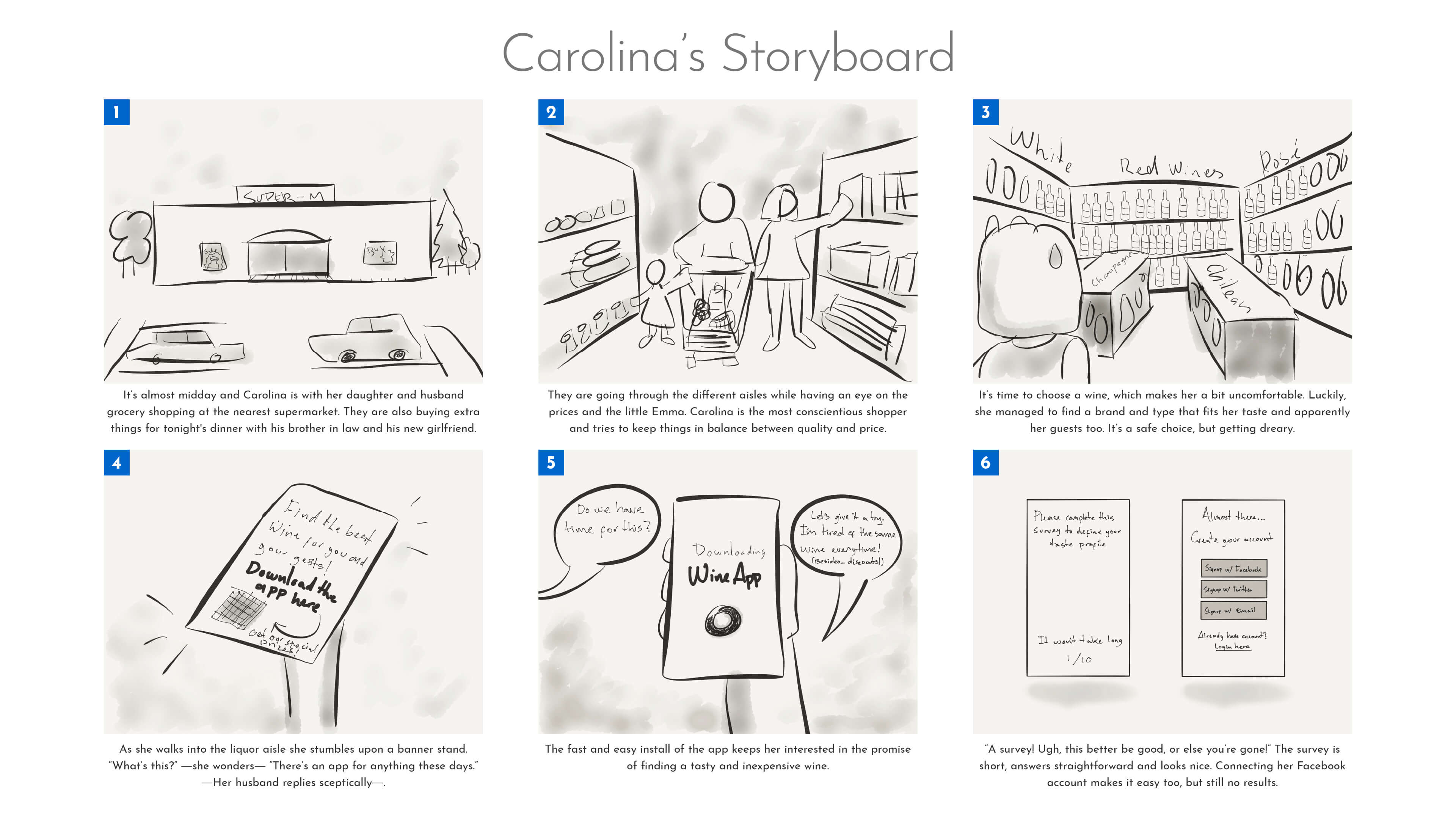
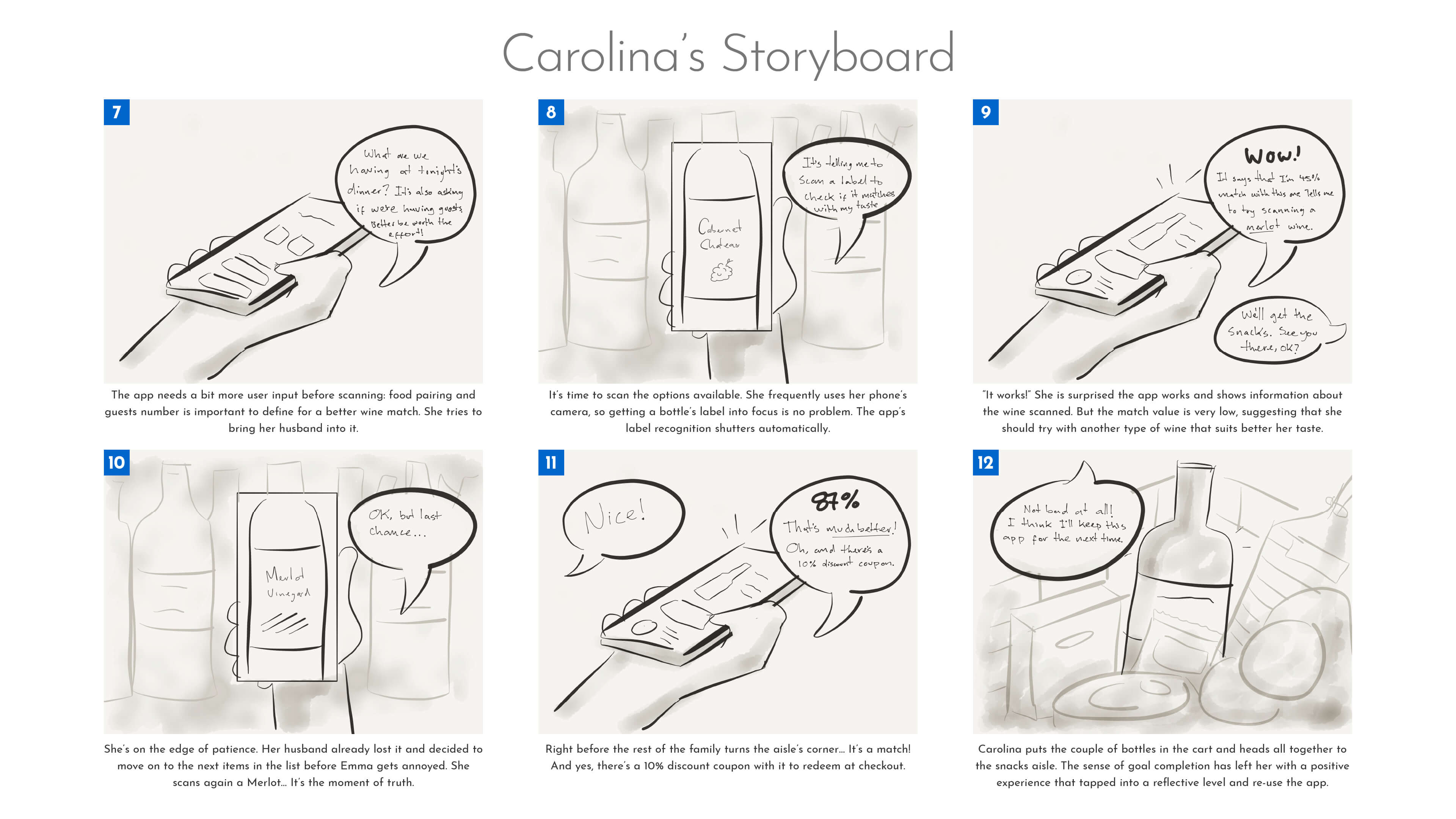
Storyboarding
The ideas I previously created needed to get stirred and put into a simulated realistic context based on what I learnt from user research. I used storyboarding to visualize how my primary persona would use some of the ideas I generated in the previous phase. This helped me get into the sketch mood necessary for fast and cheap low-fidelity prototyping.
Storyboarding helped me ground the ideas I have been developing and even come up with a few more. I was able to identify the importance and overview how each feature unfolds within the product.
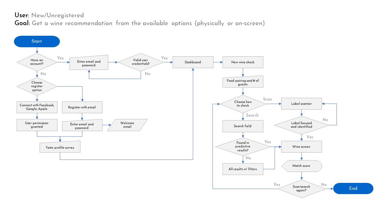
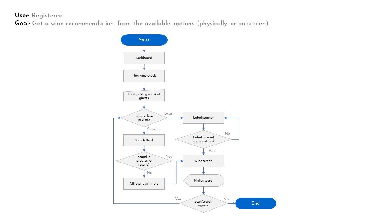
User Flowcharts
I could have used this tool before doing a storyboard, but I needed to sketch and visualize my user in the real context. Now, the objective of these flowcharts was to map the tasks in a coherent and fluent order.
Having a better understanding of these tasks and flows helped me understand how each screen must focus to provide intuitive affordances. It was a good first step towards building the conceptual model for this app.
Low Fidelity Prototypes
Please come back in a couple of weeks.
Bonus Track: Preliminary Conclusions
So far, this exercise has given me an interesting experience and some thoughts about my work as UX and UI designer:
- Solutions and products might already exist out there, but maybe they are not that good or appropriate for users. At the beginning I was discouraged by a huge app that was already giving the solution I wanted to deliver. After thoroughly studying it, I found many ways to improve and make it more appropriate for the users I meant to reach.
- Iteration is key. Many times I found myself going back and forth, choosing better tools and applying them to suit specific jobs. Practicing different tools definitely helps me to do wizer and faster choices, which is an important lesson about achieving goals within constraints.
- Identifying pains and opportunities is within my reach and skills. Most importantly, I found that I can ideate solutions and concepts that can easily be translated into features.
- Being an UX “unicorn” is tough! A UX generalist involves a great responsibility, but mostly requires a high level of detachment from the work being done, which means being as critical and unbiased as possible. This exercise made me appreciate teamwork even more.
- Design Thinking is great… If you’ve got the time. Working on Agile teams requires less time and resources, reason why the UCD and Google Sprints are a much more common approach to UX within companies.


