
Table of contents
Design problem
This startup company had a great idea that wanted to turn into a viable, recognizable and highly adoptable product. I was expected to create a global online platform for people to share inspiring and helpful travel experiences so that others can create their own.
Barriers
- The client -an amazing developer- already had some ideas and sketches of how the product should work and look like.
- Working with him and his small team required me to have everyone on board with well-founded arguments.
- Having just an idea -just the name and rough napkin sketches- was a challenge and an opportunity to flex all of my design skills.
- The development team required me to stick to Google’s Material Design system so that dev deadlines could be met.
- The business revenue models (affiliate and advertising) depended heavily on a large user base. Main objective: get as many new users registered as possible.
Process
Discovery
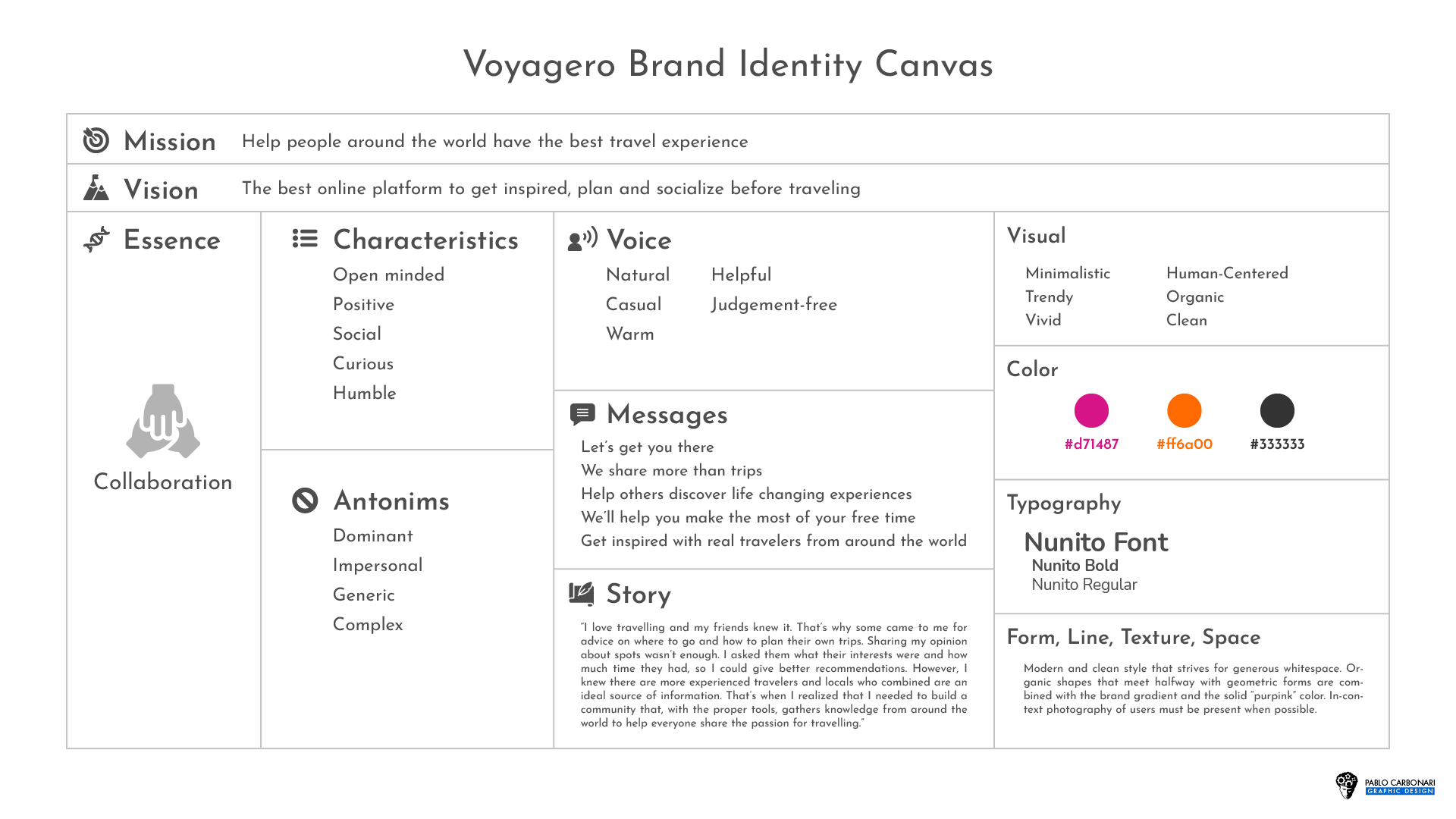
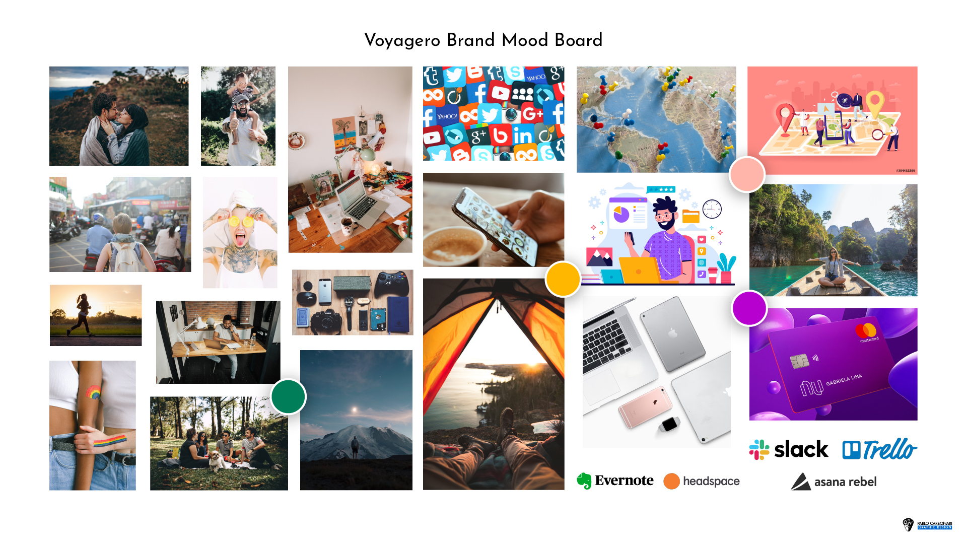
With a couple of online meetings I learnt about the mission, values and vision of the startup and the product they wanted. To define the target, competitors, references, touchpoints and personality I built a brand identity canvas and a mood board
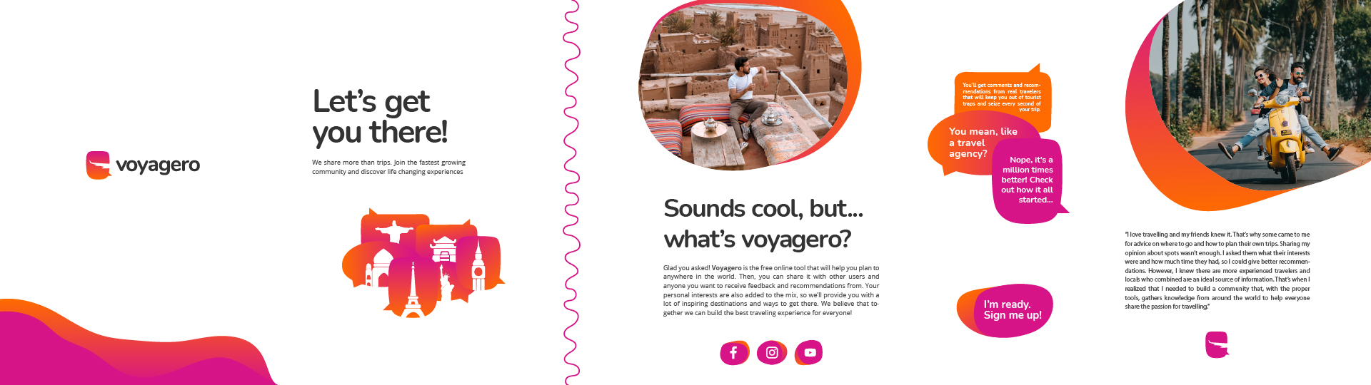
Voyagero had no direct competitors. Travel forums, travel apps (Tripit, Mapify, Tripsy, Tripify), booking platforms (Trip Advisor, Booking, Google Travel) and interactive maps (Google Maps, Bing Maps, Mapstr) do help users on specific tasks, but can’t provide holistic, unbiased, experience-based recommendations to plan a life-changing trip. “Let’s get you there” reflects the company’s collaborative and open-minded approach. This resonates with the young, mostly single, stable job, mid-tech savvy and adventurous target.
Foundation
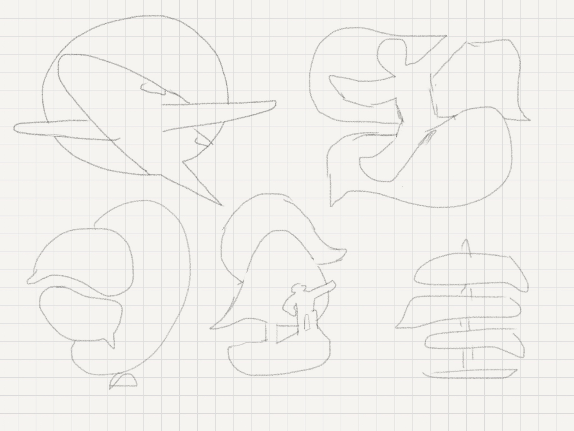
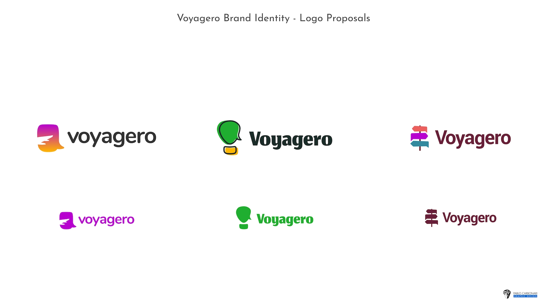
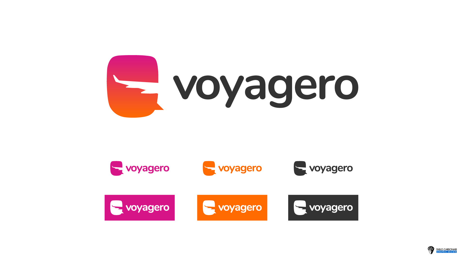
I designed three significantly different logo concepts, from which the client chose one to iterate. Once we were satisfied, I designed colour, layout, and size variations to achieve a responsive and easy-to-use (digital-first) identity.
From the initial sketches I wanted to represent most of the key brand concepts through a single composition: travel, collaboration (comments/feedback), positive social exchange, and humble spirit. From the three logo proposals I created in different visual styles, the client and I found that the aeroplane window + speech bubble logo was the best approach.
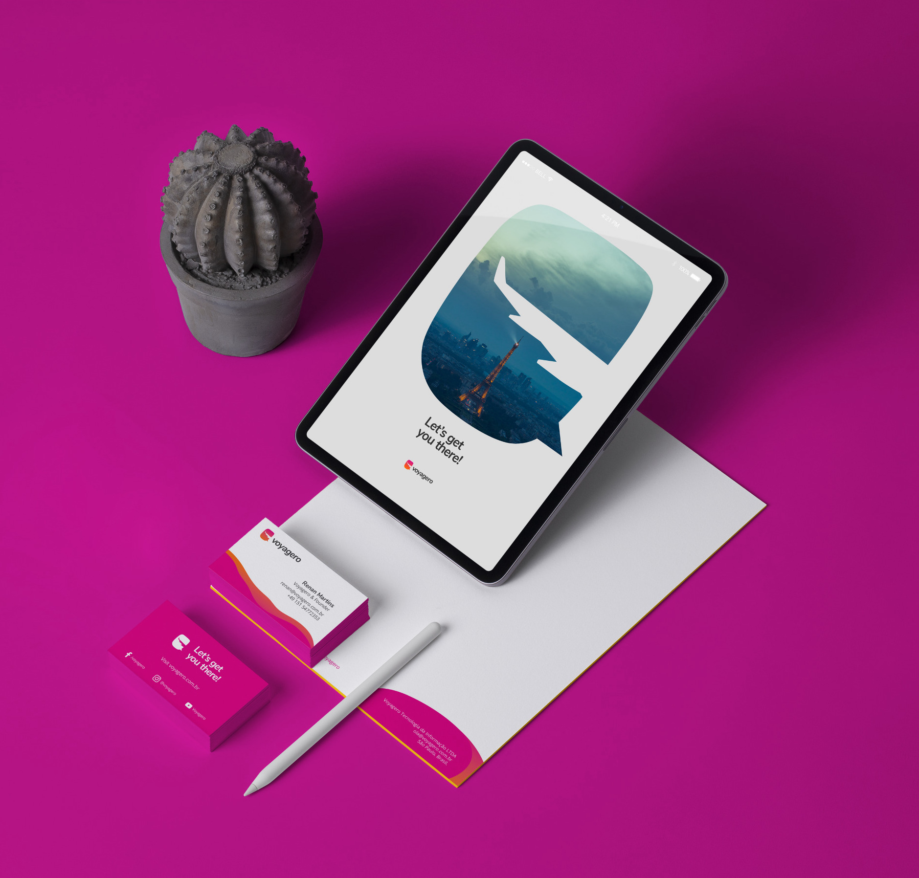
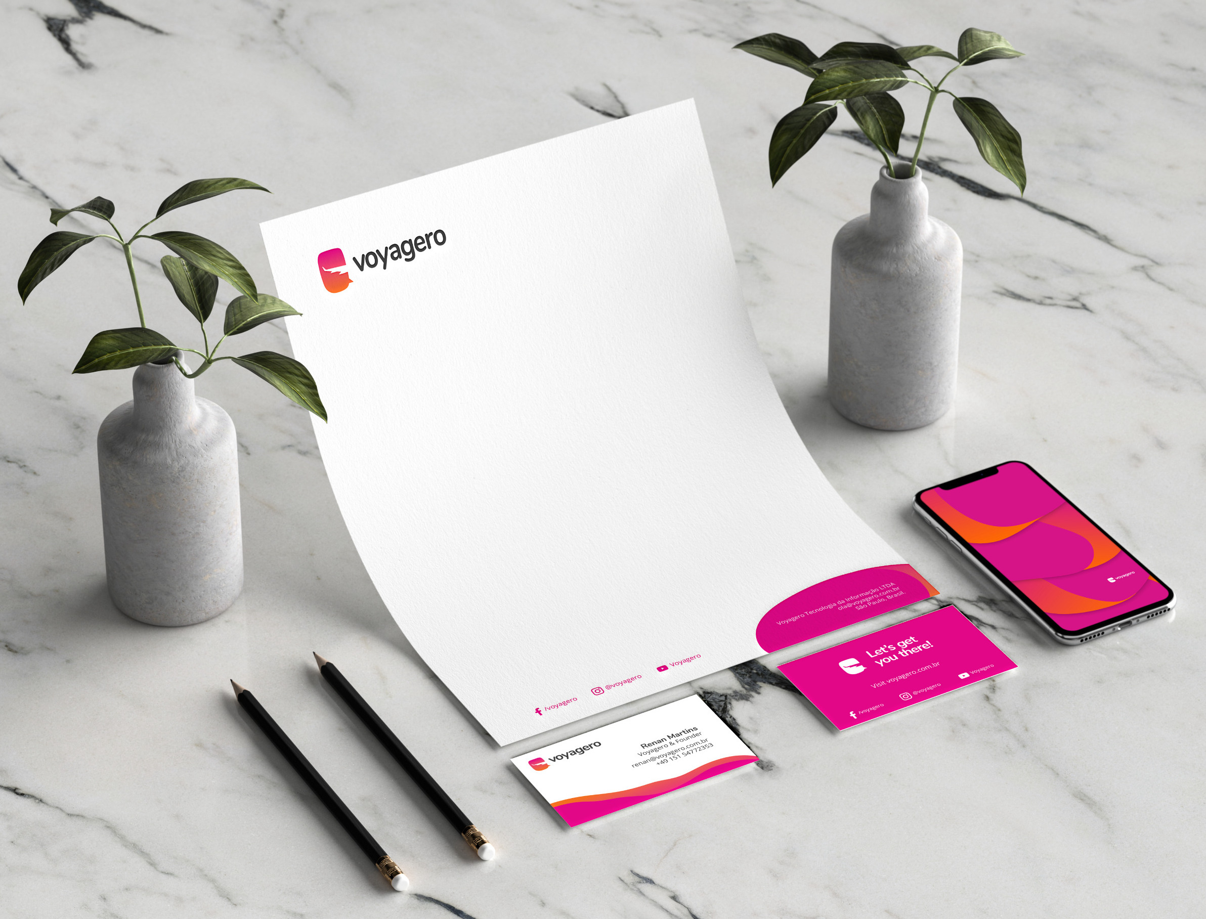
Visual identity ecosystem
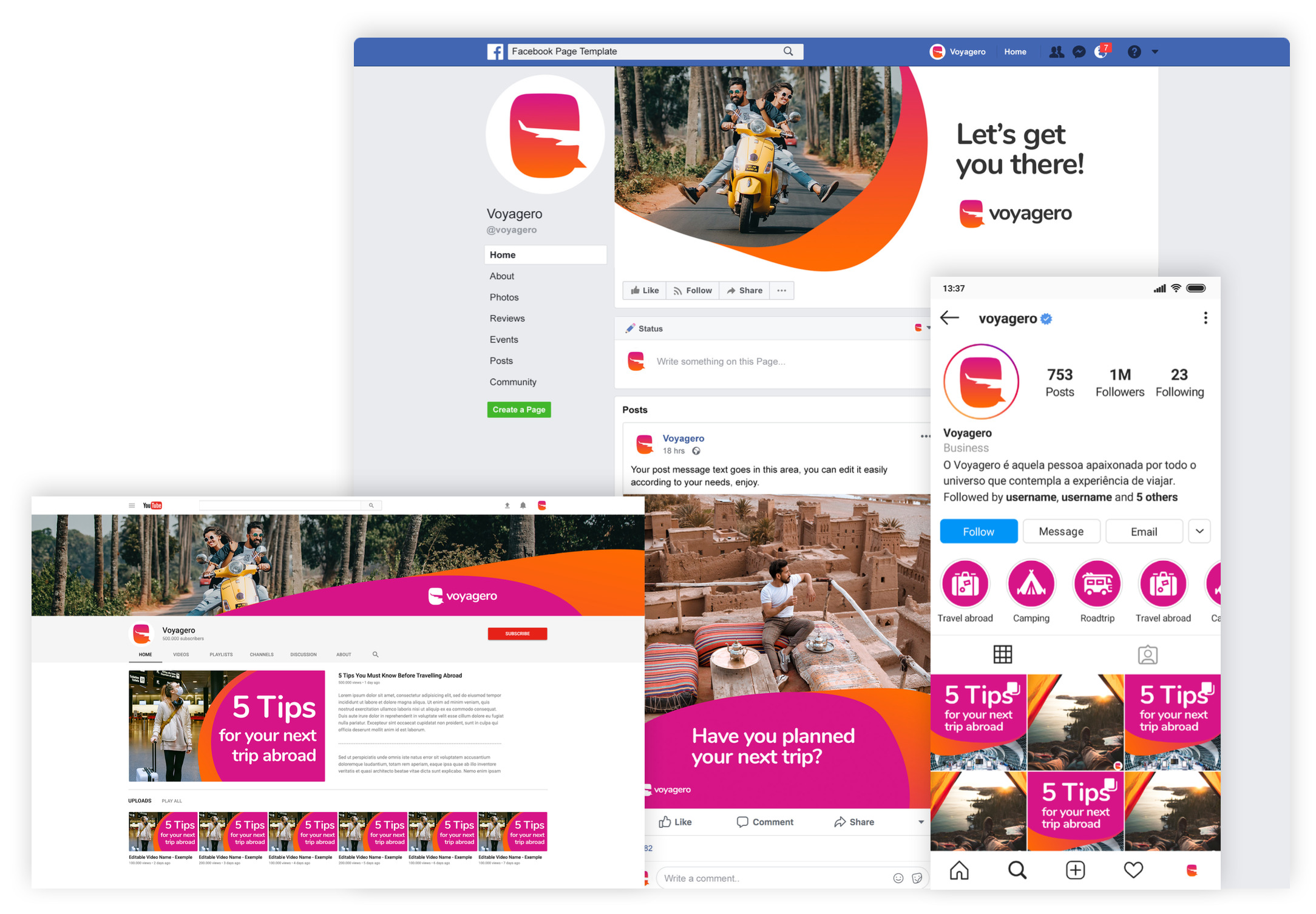
I created icons, illustrations/patterns, social media templates, email signatures, stationery, animated bumper. With these assets, I built the Visual Brand Identity Guide.
Although the logo was in place, we wanted to visually explore the potential and take a glimpse of what I could do with it on a white canvas: a brand stylescape. The speech bubble, organic forms, the sunset gradient and rounded typography became consistent with the brand and core messages.
Stakeholders workshops
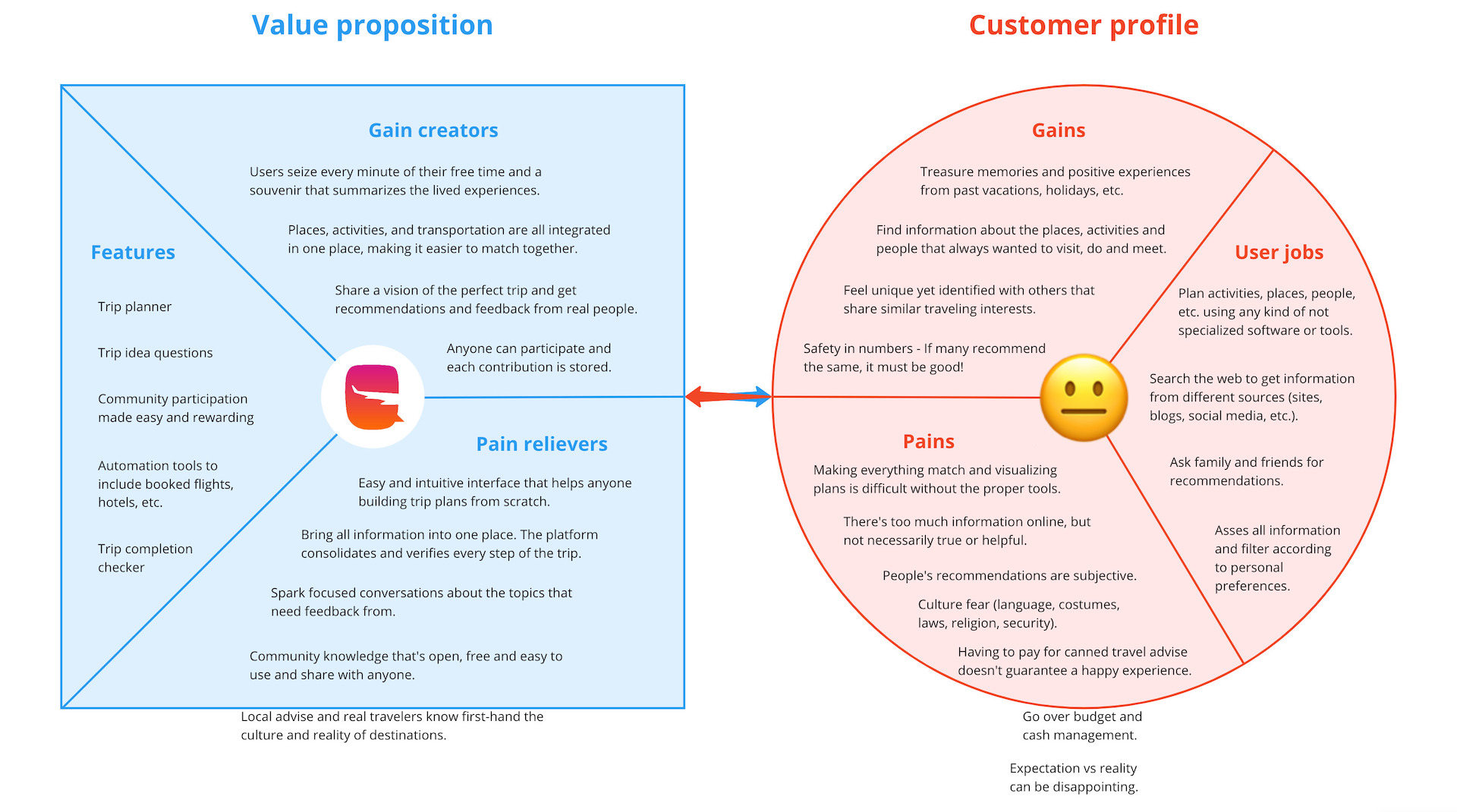
I brought the client’s attention to the MVP by creating together the Value Proposition Canvas and a first version of the features. I created a custom design process to fit the project: Design Thinking + Google Design Sprints.
The workshops solidified the idea into an original product that was to be built, but with a much clearer vision of what was needed and desired. It’s more than a trip planning tool: users can build collaborative trips and give/receive feedback. The customer profile balanced the equation with a glimpse of how potential users (target) would look: unsatisfied with lots of tools that work separately, without real-world experience and difficult to customise.
Target: 20 - 40 years old; female and male; mid-income; live on rent; enjoy travelling; couples and singles; work on stable jod; use social networks; tech savvy; adventurous; open minded; adaptive; physically active.
Show me the canvas and features
Empathise
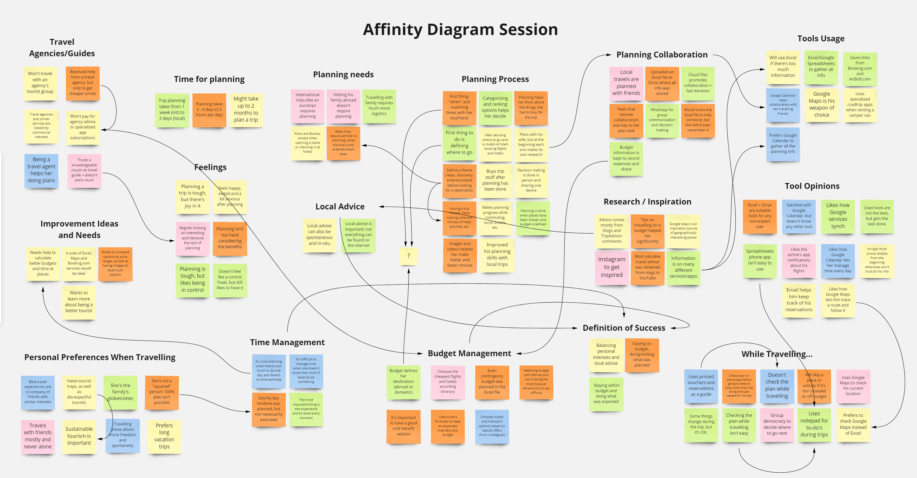
I designed and conducted quantitative and qualitative user research to learn about the people the product could reach. I designed, conducted and analysed the surveys and interviews, which I used the data to create an affinity diagram. Conducting quantitative research first was a very accurate decision. Not only helped me to refine the customer profile from 244 participants, it also allowed me to identify candidates to interview (5 participants).
Based on key findings from quantitative research:
- The average participant is 35 years old; used to travel 2-5 times per year; travels abroad and domestic for leisure (eg. vacations).
- The younger will tend to travel alone while the average will do it with its partner; people who plan their trips (months ahead mostly when abroad) are divided between specialised (Trip Advisor, Google Maps, etc.) and non-specialised software (word processors, spreadsheets, notepads) and the average level of satisfaction using these is 3.7 out of 5.
- Ease of use and sharing options are desirable features to improve satisfaction.
- 76% of participants are willing to try a free planning tool.
Show me the research tools and results
Define
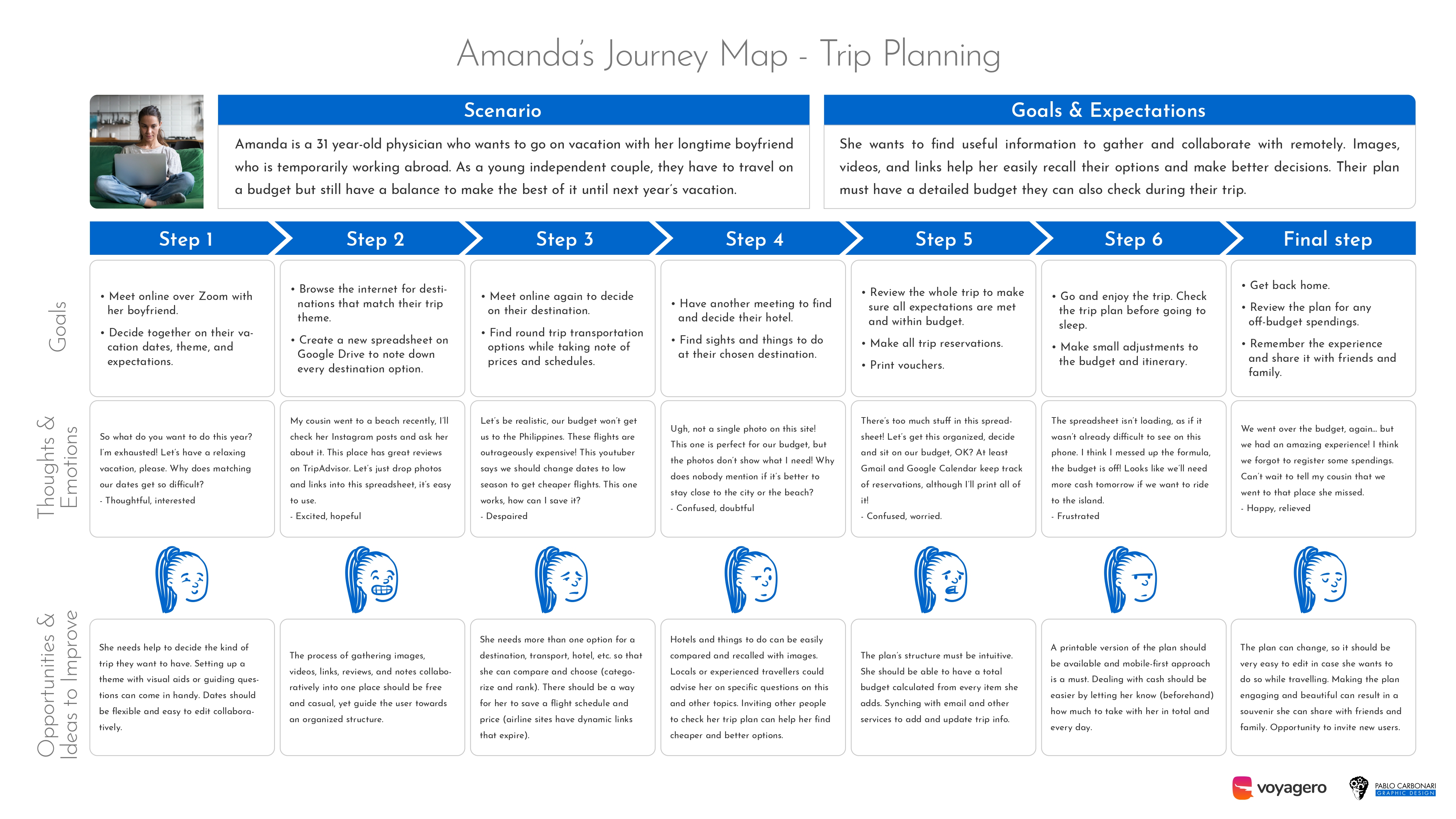
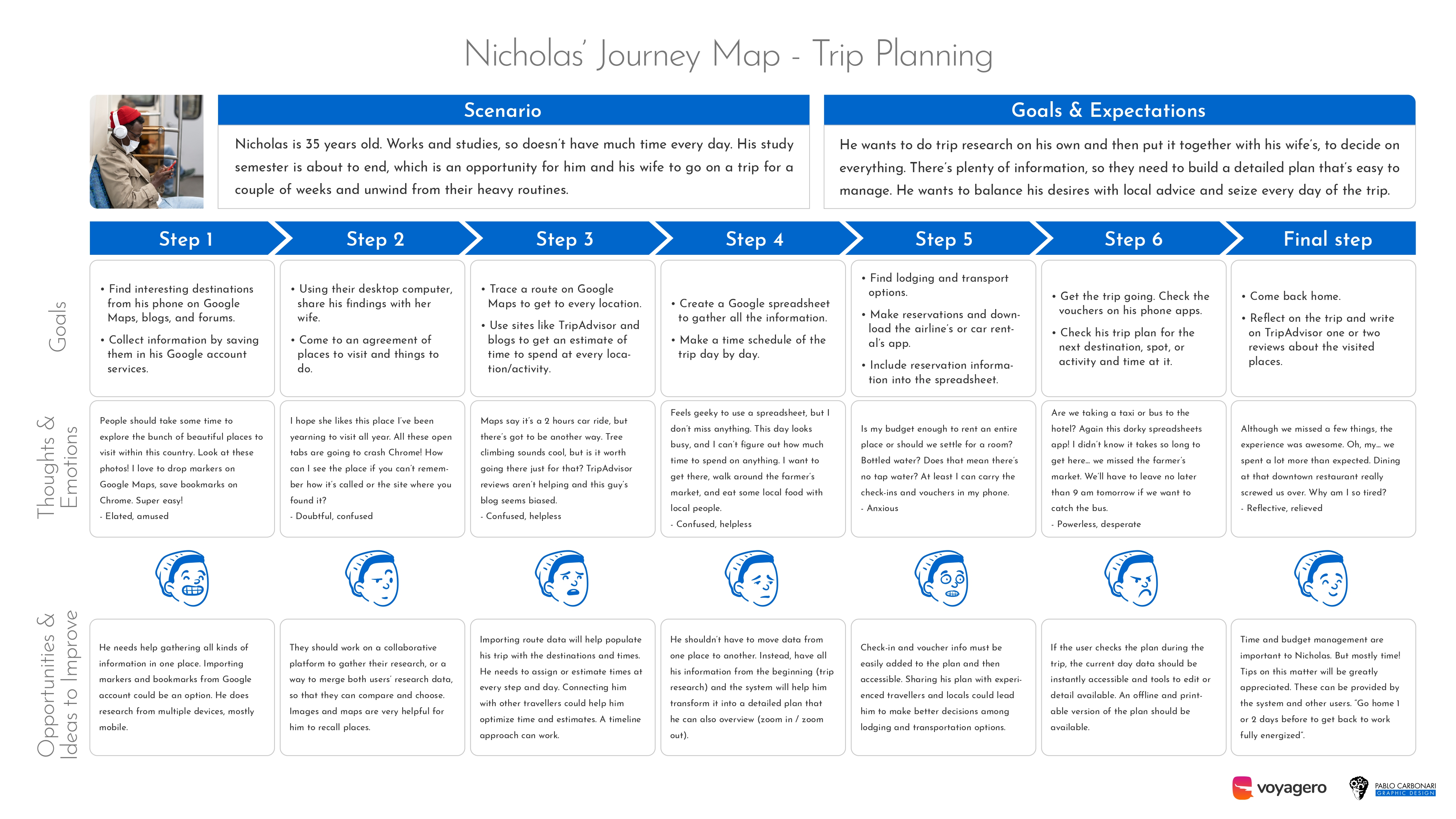
I achieved a deep understanding of the user’s needs, wants and limitations. I tapped into their influences, context, and motivations to deliver actionable problem statements. Empathy maps, personas, user journey maps, and points of view were my weapons of choice
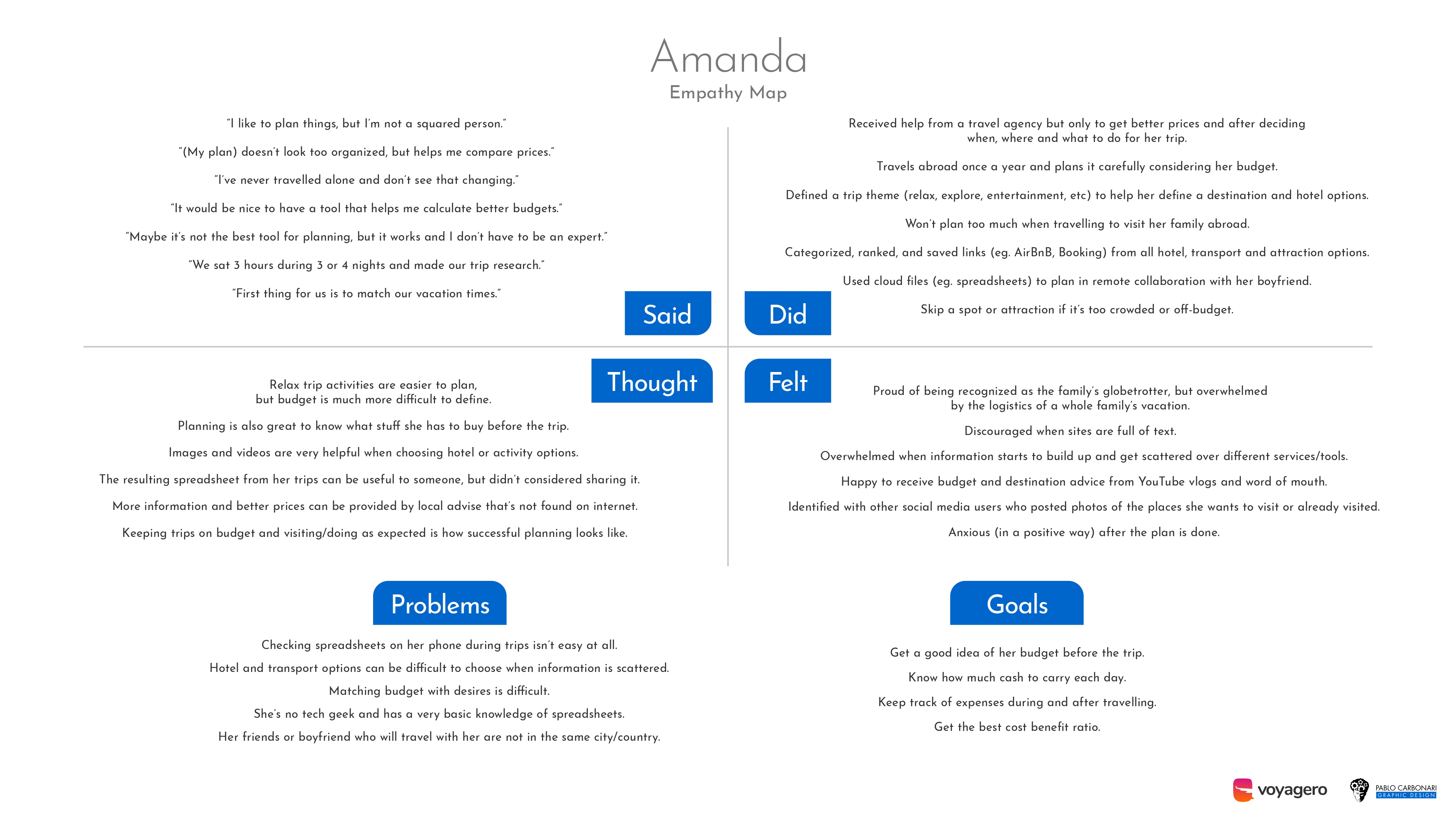
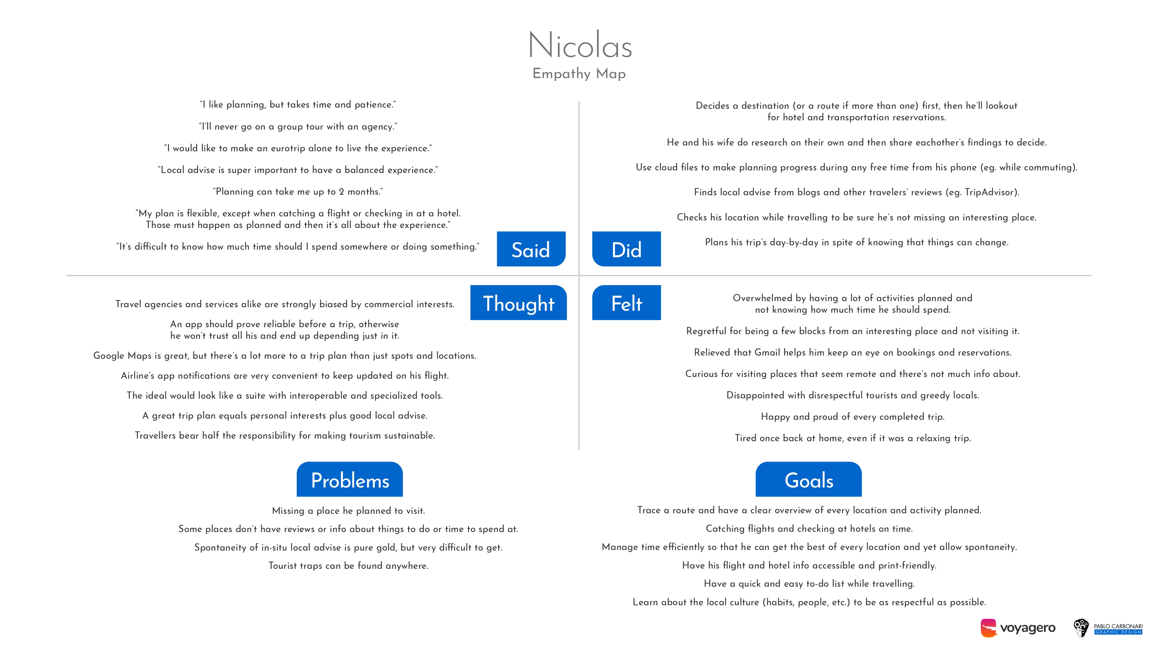
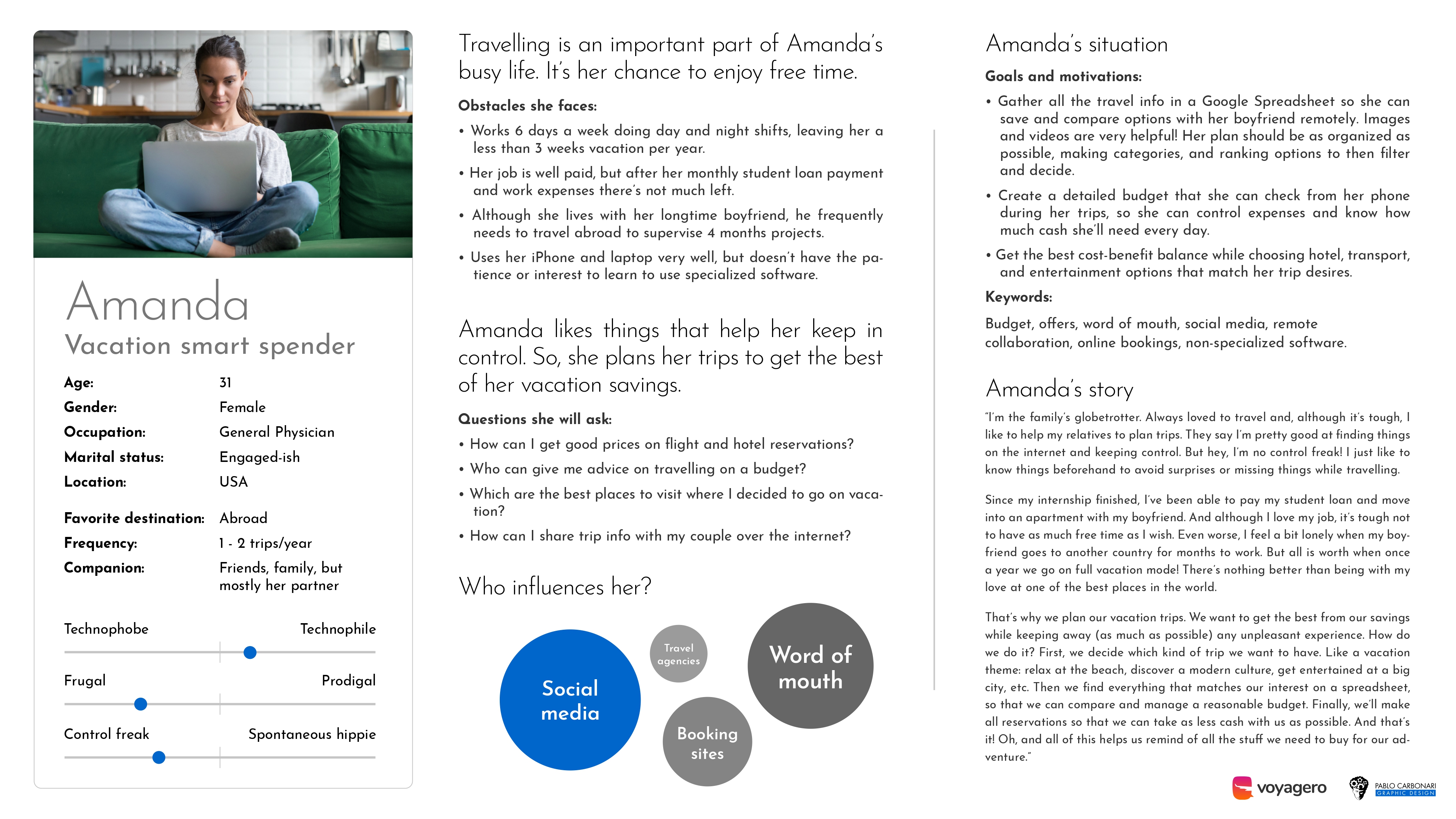
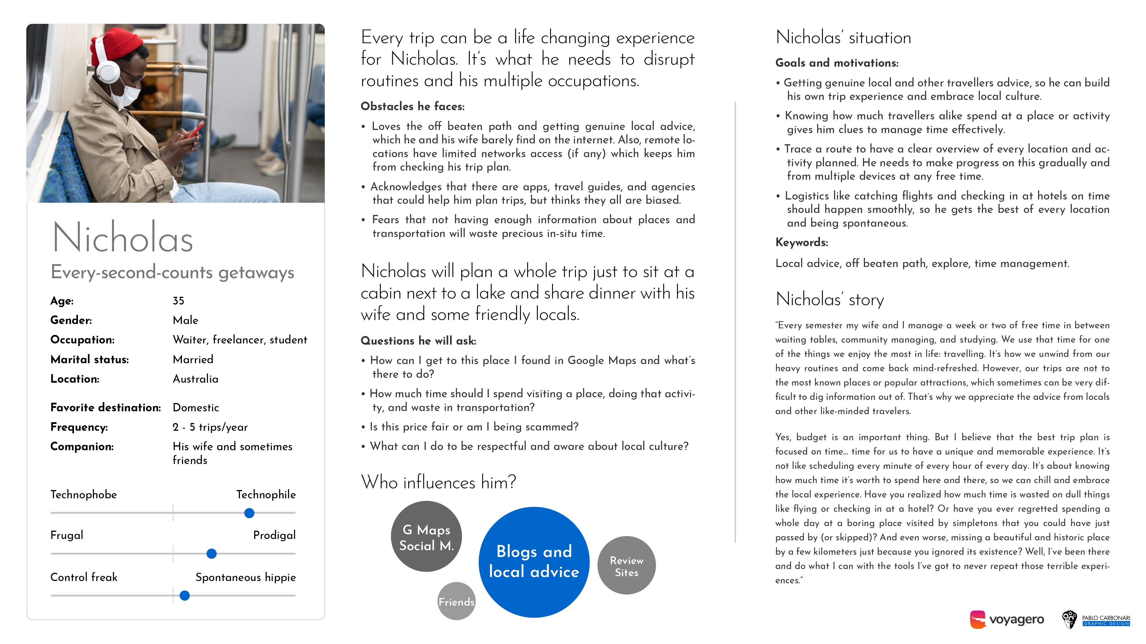
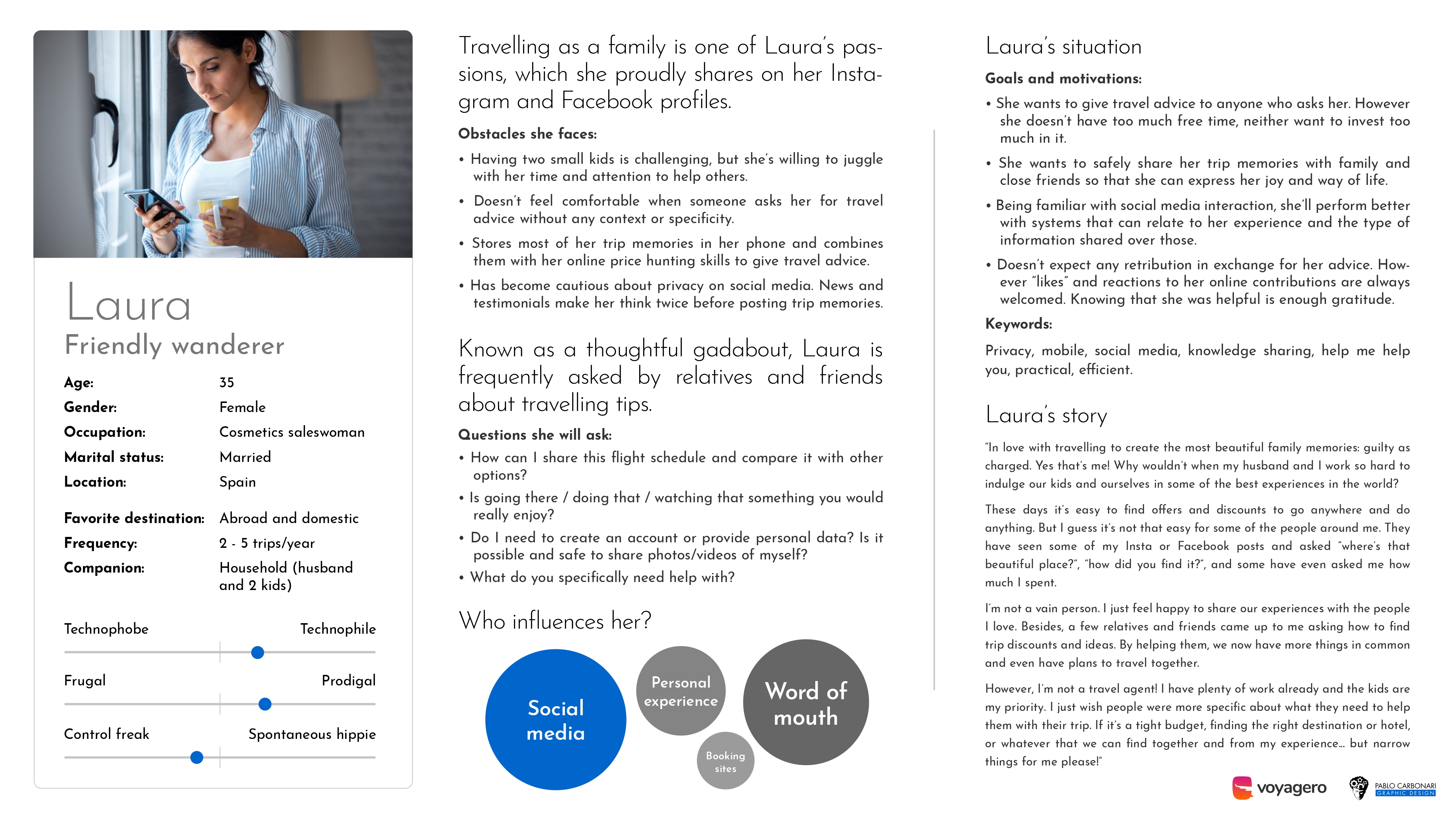
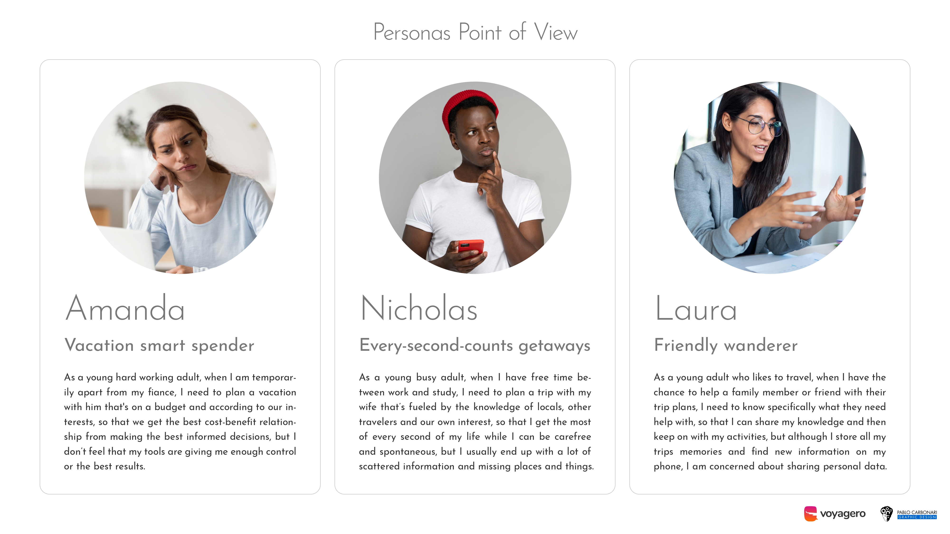
Creating the affinity diagram with stakeholders really got the juices flowing. I identified patterns and defined three personas: Amanda, the vacation smart spender; Nicholas, an every-second-counts getaway traveller; and Laura, a friendly wanderer that loves to share. Each one has different goals and motivations, but they are complementary to the objective of the product and its features. The key was to keep every persona at the front and centre from now on.
Ideation
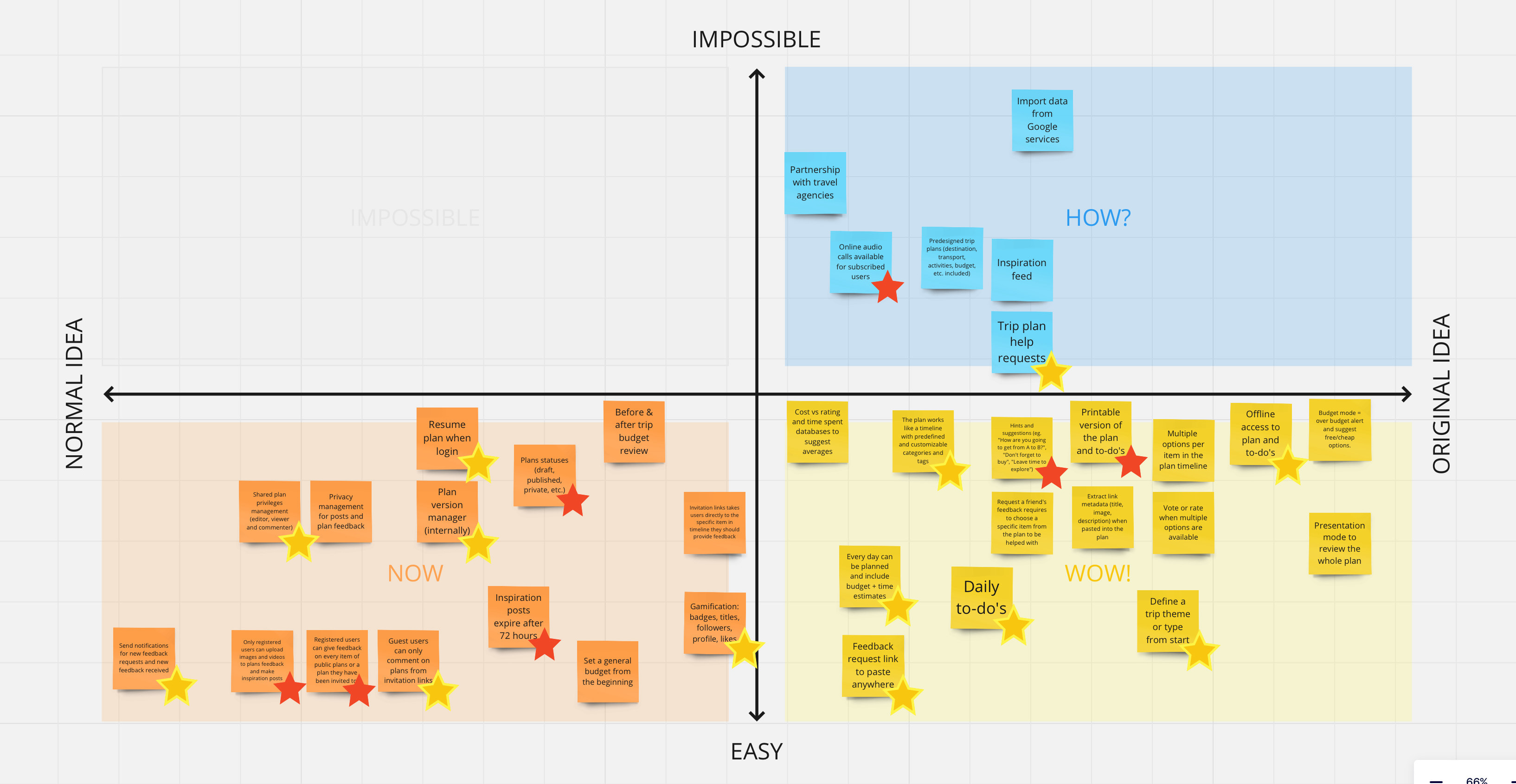
In a couple of workshops with the stakeholders, we came up with a large number of ideas which we cut down into the best, most practical and innovative ones. Crossing the answers to “how might we” questions with the affinity diagram, refined, contextualised and categorised the ideas, then filtered with the “now, wow, how” matrix.
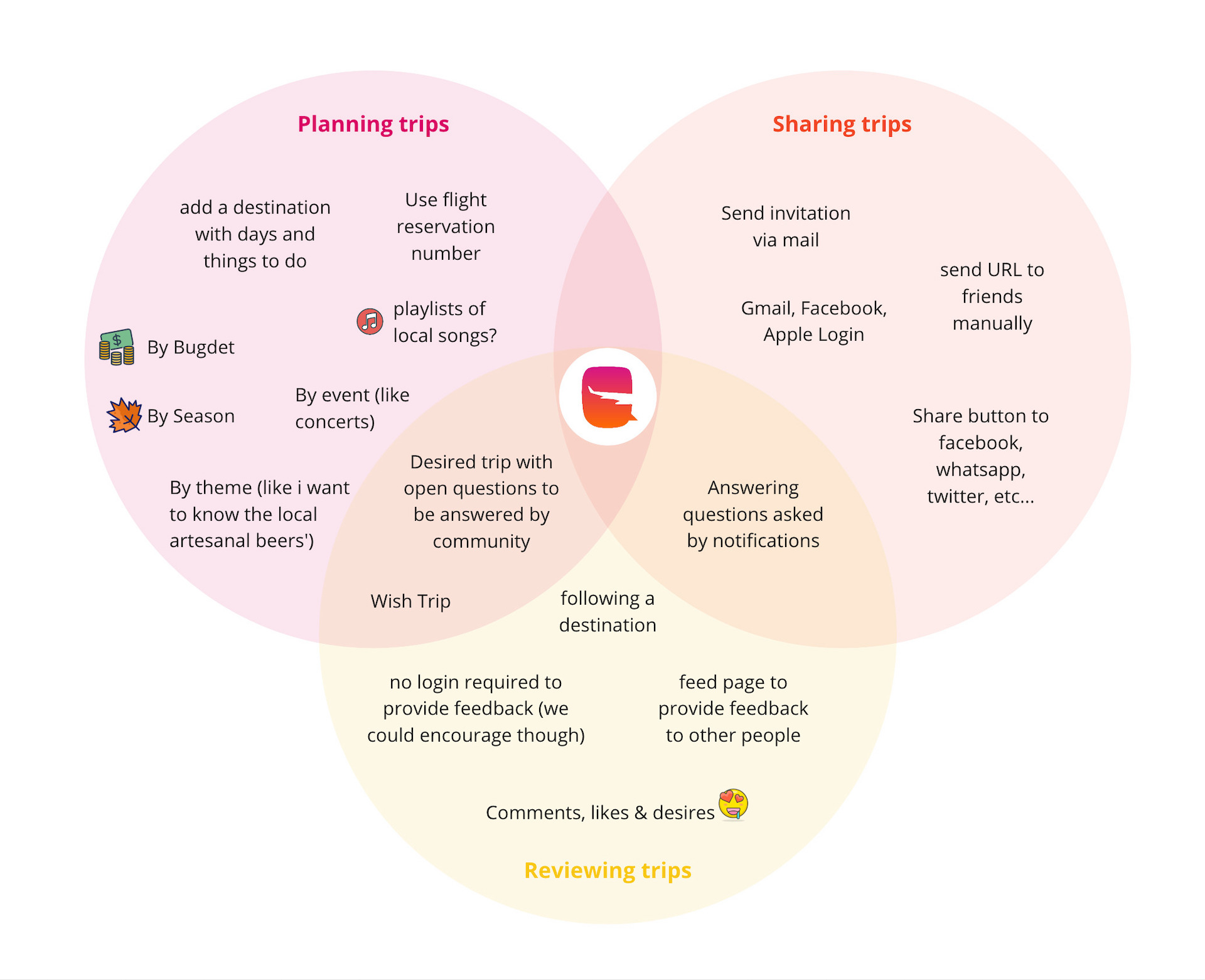
Having an interdisciplinary team to generate ideas really paid off. Not only we generated ideas for the MVP and future versions, but also many original and unexpected solutions came up:
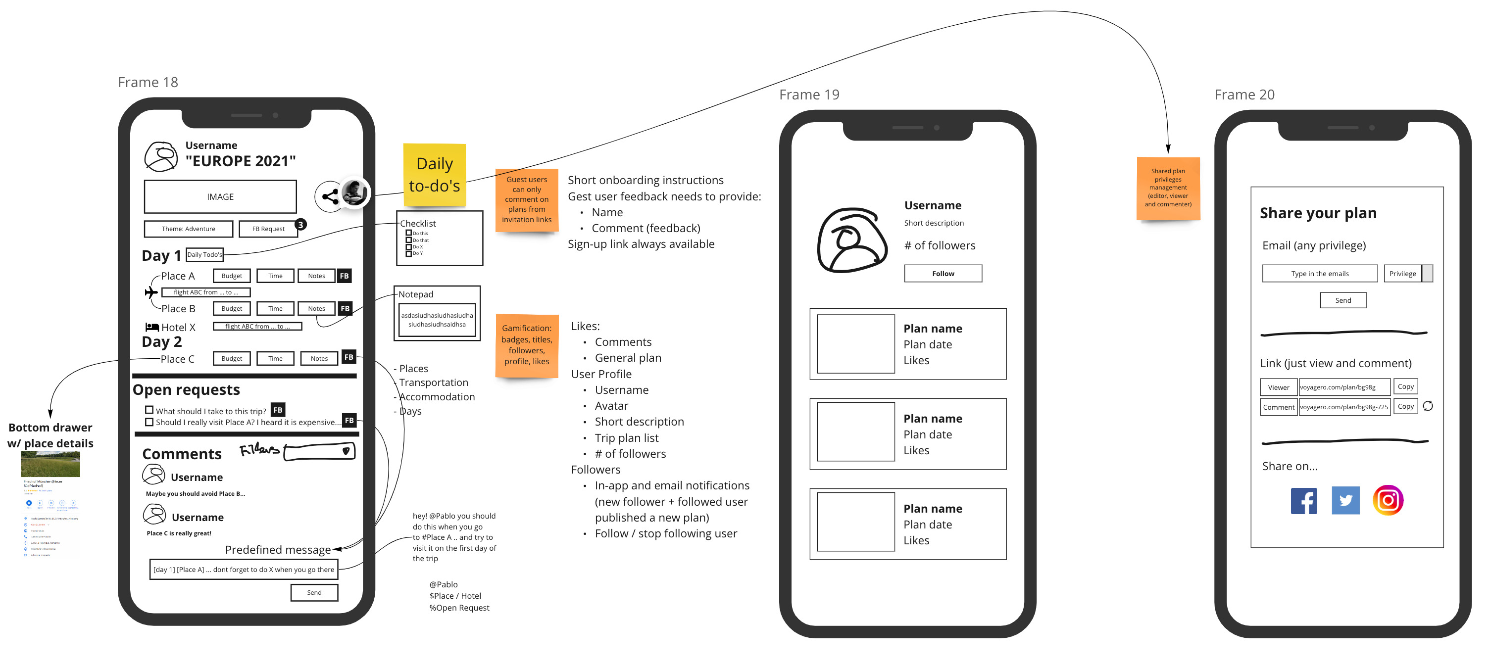
- Day-to-day planner that includes time and money budgets
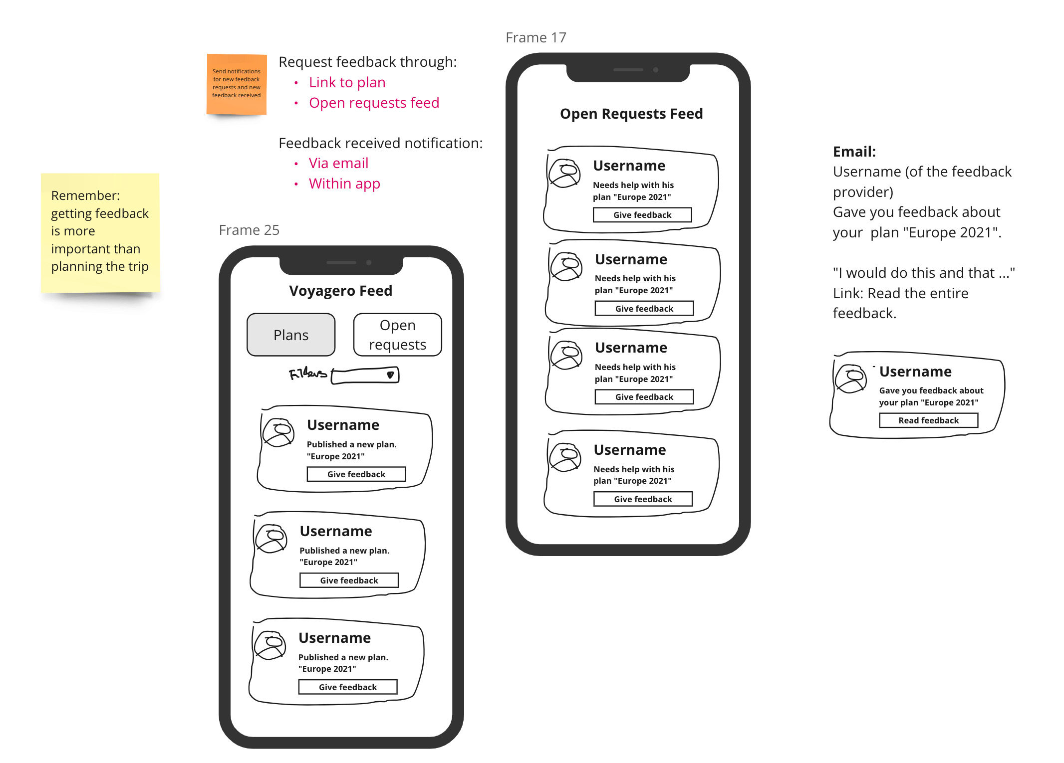
- Copy-paste link to openly share the trip plan and get feedback from (registered or guest) users
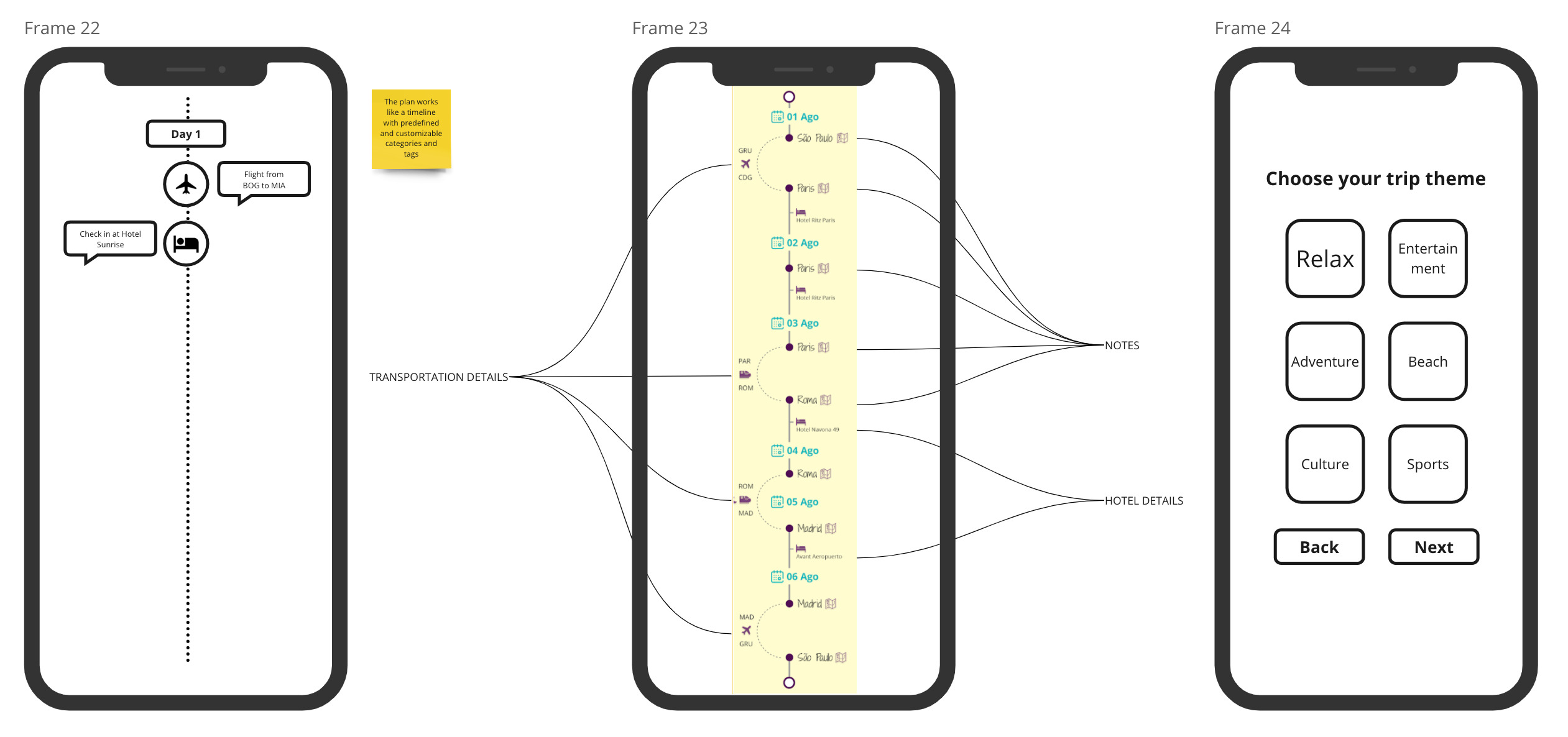
- Trip themes/types as templates for new plans
- Open requests to ask registered users for advise presentation mode and printable versions to review the plan in an optimised view
Design studio
Following Google Design Sprint methodology, we sketched, decided, prototyped and validated the core features that the MVP needed to have. Low-fidelity prototypes brought light to what both sides were expecting of the product functionality
We found inspiration from existent tools, but chose to use an original yet familiar way to visualise data: the timeline. This became the product’s core from which the rest of functionalities gravitated.
Prototype and test
I designed high-fidelity prototypes until I realised that the trip creation feature was a bit tricky for users to understand. So, I decided to build mid-fi again and test different user flows and patterns of use; deployed to Maze a high-fi version and conducted the usability test with a 28 participants panel. Of Course, I chose the best performance prototype, tested again, made adjustments, moved to high-fi and included it into the MVP. I designed the mobile, tablet and desktop screens deliverables.
Second test results showed:
- 26% less time to create a trip item.
- 41% less miscliks.
- 17% more positive feedback from users.
Although unregistered users could comment on trip plans, I promoted registration by unlocking more engaging functionalities: create trips, ask for feedback, custom trip recommendations based on profile interests, comment with images, inspiration gallery.
Ensure scalability
Digital products are always changing, more so in the case of MVPs. To help future developments consistency and meaning, I created Voyagero’s UI Design System. This works as the single source of truth for anyone contributing to the project. In the document I defined UI patterns like colour scheme, components, icons, layout grids, typography, and the baseline theme and behaviour.
Working with a base design system (Material Design) was an advantage to ensure the adoptability of the product by a broad user base. Also, by doing so, the development time was reduced (30% according to client’s estimate).
Key learnings
- Not everything has to be an app. The user’s context of use, client’s budget, and tech barriers must be considered. The MVP became a mobile-first web app.
- Advocating for users is my core, but it can be an impossible goal if I don’t understand the business needs. After all, it’s the client who is paying for a viable product.
- Not all features must (or can) be included in the MVP. Being objective and truly understanding the user’s needs can help me focus on fundamental and scalable solutions.
- Developers can be creative, empathetic and designers. Sharing user research findings and low-to-high prototypes with them is not just teamwork, it’s a win-win deal.